By Claudia Marina
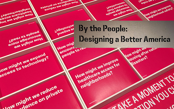
For the past ten years, Cooper Hewitt, National Smithsonian Design Museum has dedicated exhibition space to designed objects that defy the very idea of being displayed in a museum. This is partly a result of the work of Cynthia E. Smith, Curator of Socially Responsible Design, who has travelled across the United States visiting poverty-stricken areas in search for design that stems from everyday necessity. In 2007, this culminated in the exhibition titled Design for the Other 90% (later changed to Design and the Other 90%) followed by Design with the Other 90%: CITIES in 2011, and most recently By the People: Designing a Better America, which was on view from September 30, 2016 to February 26, 2017.
The latest exhibition in the series comprised the entire third floor of the Barbara and Morton Mandel Design Gallery, taking viewers through a narrative of necessary, ambitious, and responsive design solutions as well as propositions to situations brought upon by poverty in America.
As Smith notes in her essay “Designing an America of the People, by the People, and for the People,” featured in the exhibition’s namesake book, poverty is more nuanced than what is typically portrayed. It often hits very close to home. “It is the family carrying all of their possessions by train to the next shelter, the grandmother who wakes up at 4:30 in the morning to get her grandchild ready before she begins her two-hour daily bus commute, the child going to bed hungry because school is not in session, the gay teenager hitchhiking cross-country escaping to a safer place,” Smith writes. Oftentimes, there are people who may not necessarily call themselves “poor” yet are still likely to engage with the objects highlighted in the show. This is design by the people, for America, and of need.
The 60 items displayed exemplify both the tactical and strategic. Red Hook WiFi, for example, emerged as a response to the effects of Hurricane Sandy in 2012 which left the already-underserved neighborhood of Red Hook in Brooklyn without internet access. The non-profit Red Hook Initiative designed a decentralized local mesh network connected by routers mounted on the roofs of homes for local businesses, residents, and churches that is still maintained by a youth group of “Digital Stewards” engaged in a yearlong tech program which the initiative supports. On the more formal end, there’s Detroit Future City, a 50-year plan to address the dwindling city’s problems of income and racial segregation. The strategy developed by architects, urban planners, economists, and environmentalist’s flirts with tactics (26 to be exact) such as video games and remote phone-in town hall meetings in order to engage community members in the planning process in such a way that feels more empathetic than a public relations stunt.
This dialectical and sometimes transient relationship between what design strategist Ezio Manzini calls “expert” and “non-expert” design is closer to the messy territory that encourages design to succeed if only because trying is tantamount to practicing the everyday. One has to wonder whether some of the objects in the exhibition are trying too hard and risk being out of touch. Sometimes a busy mom just wants to give her child an afterschool snack without being reminded by a sticker on the package of Goya Maria Cookies that snack time is a prime opportunity for introducing “brain building activities.” This was the product of Vroom, a collaboration between the Bezos Family Foundation, IDEO.org, and Johannes Leonardo creative agency which attempted to facilitate early childhood learning at home through the use of household products such as baby lotion.
Ultimately, when walking through the exhibition, one faces the question of whether or not these objects should be taken out of context and placed in the vacuum of a national design museum. For education’s sake, the answer always seems to be yes. Though the exhibition was enthusiastic about presenting the ideas of the “citizen-designer” alongside professionals, the tone—despite its best efforts—at times seemed a bit top-down. Presented as a whole, the collection conveyed a bit of loftiness, as if to say, “look how inspirational Americans can be when they have to make-do.” That being said, the exhibition and its series’ predecessors can serve as a prototype for how design museums look at the century ahead of us, expanding the definition of design in the public realm.
Tags: By the People, Cooper-Hewitt, Designing a Better America, Exhibition Review, Exhibitions