Last November the Yale School of Architecture hosted a two-day symposium on the work of seminal architect, designer, writer and teacher George Nelson. Susan Yelavich was invited to attend and review the event for the School’s journal Constructs.
This could not be a more propitious time to reprise and re-appraise the contributions of George Nelson (B.A.1928; B.F.A. 1931). Designers, and those who study them, are increasingly critical of the limitations of market imperatives that admit no other values. As a result, we are seeing other models of practice, such as those involved in the creative commons or service design, gaining a currency of a different order. These alternatives owe a debt to Nelson, a miscast midcentury Modernist. I say “miscast” because the dominance of celebrity and branding in today’s design culture has had the effect of reducing Nelson’s contributions to a shorthand of icons: the Ball Clock (1949), the Bubble Lamps (1952), and the Marshmallow Sofa (1956). (No matter that two out of three, the clock and sofa, were designed by Irving Harper.)
All the same, Nelson must shoulder some of the blame for today’s cult of design. He cultivated brands, most notably Herman Miller but also that of the postwar United States. The government was one of his most important clients. He relished the public face of authorship and rarely credited his collaborators, including the aforementioned Harper. Nelson was also a vigorous champion of the role of industrial design in increasing corporate profits which, admittedly, were not the sole prerogative of the one percent, as they are today. That said, he fully understood the caveat “Be careful what you wish for.” Nelson had an uncanny ability to nip at the hands that fed his practice, without sacrificing their allegiance. He was the paradigm designer– cum–public intellectual.
Last November, the Yale School of Architecture hosted a symposium that took a major step in assuring that status to George Nelson. The world that made him, and that he in turn shaped, came to life with a full-dress parade of historians, accompanied by a cadre of his contemporaries in practice. Organized by Dietrich Neumann, Rauch Family Professor of History of Art and Architecture at Brown University, the symposium was timed to complement the traveling exhibition George Nelson: Architect, Writer, Designer, and Teacher, curated by Jochen Eisenbrand for the Vitra Design Museum, with the architecture aspect expanded by Neumann.
The logic to the proceedings was relatively straightforward, moving from background to foreground: it unpacked Modernism as a style and ideology, then examined the culture it produced and the responses that flowed from Nelson’s office. The only cavil was the absence of the kind of transdisciplinary designer that Nelson would have recognized, although Yale’s Ned Cooke did his best to frame Marc Newsom in the experimental mold of Nelson.
Some of the sixteen featured speakers circled around the subject so broadly as to all but leave Nelson out of the frame, while others spoke from an intimate perspective as veterans of the office and the era. Yet others presented prized discoveries that come only from highly focused research. A few speakers offered revelations regarding Nelson’s achievements as well as fresh insight into the nature of the design itself. It is to these three overlapping paradigms—context, discovery, and insight—that I’ll address my comments.
One of the roles of scholars is to ensure that we don’t conflate contemporary circumstances and values with those of the past. Given the remarkable lacunae in our memories, even of developments in the twentieth century, their job is to construct theory in a time machine. And here, we were delighted to enter with them. Curator John Stuart Gordon, of the Yale University Art Gallery, offered choice selections from his research on the nuclear age, revealing an American naiveté almost unfathomable today. For example, house paint was alleged to withstand the heat of a nuclear blast. Ad copy for a rhinestone pin, styled after the ellipses of the atomic symbol, read, “As daring to wear as dropping the atomic bomb.” Mid-fifties promotional materials celebrated the ease with which radiation could be wiped from the flat surfaces of Modernist furniture.
While Gordon stopped short of suggesting that American Modernists profited from the bomb, Donald Albrecht, independent curator, pointed out that most Americans would have been introduced to the modern long before the atomic age. Prewar movies equated it with style (luxurious fashion and Art Deco glamour), while postwar films were more likely to register the disquiet of modern life. Movie credits, just coming into their own, also projected the values of Modernism, salutatory and otherwise. The Modern had become a matter of sensibility, very often noir. Case in point, The Misfits (1961), the jaded antithesis of the classic American Western. While noting the Nelson office’s work on that film, Albrecht focused primarily on the work of Saul Bass, highlighting the titles for North by Northwest, in which a gridded skyscraper becomes a cage for the credits. But where Bass used style to convey the underlying sense of threat that hung over the atomic era, Nelson would use language and the new medium of television to express his ideas.
Of course, the appearance of the Modern provoked anxiety well before Hiroshima and Nagasaki and the Cold War that followed. And, in one sense, those acts of annihilation were not unrelated to the form that Modernism took. Both were a product of an ethos of purification. Since the beginning of the twentieth century, designers had been working to eliminate ornamental signs of class and bring their work in line with the zeitgeist of technological change. (Later in the symposium, Murray Moss would cite the era’s refusal of the irrational as the formative influence on Nelson’s sensibility. In contrast to Rob Forbes, of Design Within Reach, who all but channels Nelson’s aesthetic, Moss conceded only one point of sympathy—that meaning comes not from isolated objects but from relationships among them.)
Tempering the avant-garde’s ruthless pruning, progressive American furniture manufacturers offered “livable” Modernism— the subject of Clark University professor Kristina Wilson’s paper. Within the loose category of “livable,” Wilson identified affinities with the city and the suburb, along with individual and conformist ways of living epitomized by Gilbert Rohde and Russel Wright, respectively. Of the two, Rohde proved more critical to Nelson. Rohde was his predecessor at Herman Miller and developed modular systems that prepared the way for Nelson’s more ebullient work in the same terrain that would prove to be truly non-conformist.
Museum of Modern Art curator Juliet Kinchin moved the conversation from issues of middle-class norms to Nelson’s outright skepticism about any attempts to codify taste. She noted that design was not, as he put it, a “social register.” It was not an authoritarian museum’s pronouncement of quality. Taking aim at MoMA’s exhibition Useful Objects Under $10 (1954), Nelson wrote that design “is a manifestation of the capacity of the human spirit to transcend its limitations….It is a statement, not a gadget.”
Undeniably, Nelson’s work (especially for Herman Miller) benefitted from the synergy between museums, designers, and manufacturers— a synergy that was a hallmark of the era. Yet with acerbic wit, Nelson managed to sustain a contrarian stance while collecting his fees. (One of the most hilarious instances of his remarkable ability to straddle the fence between collusion and critique appears in a 1956 television ad made for, and commissioned by, Herman Miller. In a parody worthy of Monty Python, Nelson shows an energetic young woman ineffectually trying to saw through an Eames Lounge Chair and tossing its feathered stuffing into the air to extol its strength and comfort.)
Appraising Nelson’s early career and formative travels, Yale professor Kurt Forster offered further insight into Nelson’s critical yet engaged position within the world of design, reaffirming his role as a paradox. Forster claimed that “Nelson translated editorial thinking to the design of furniture.” I would argue that, even beyond the curation of ideas, it was the iterative process of revising and editing that conditioned Nelson’s approach to design as a process of questioning. What differentiated his critiques is that they extended beyond the inner sanctum of the studio, ranging from the micro to the macro to the meta, from products to their social effects and the ethical nature of design itself. Traversing these scales, Nelson developed an integrated approach to practice and theory at the beginning of his career. Forster recounted that Nelson had been educated as an architect at Yale, yet when awarded a 1932 fellowship in architecture at the American Academy in Rome, he directed his energy to writing. His interviews with European architects for Pencil Points played a seminal role in introducing Americans to Modernism.
Moreover, it was Nelson’s prose, not his experience as a designer that would extend his practice into the domain of furniture and graphics and, ultimately enlarge his thinking about the constructive/destructive nature of design. Ralph Caplan—who said he met Nelson first through Nelson’s writings— recounted that in 1945, D. J. Dupree, then chairman of Herman Miller, offered Nelson the post of director of design solely on the basis of a book chapter.
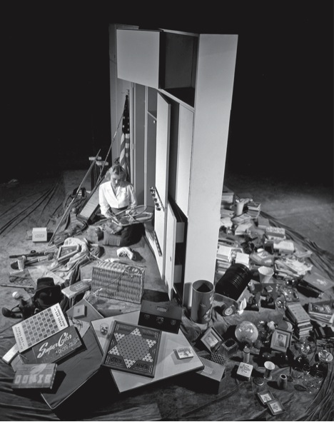
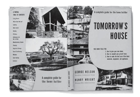
The chapter in question appeared in Nelson’s Tomorrow’s House (co-authored with Henry Wright in 1945), and it addressed the issue of storage in the Modern house. This was particularly problematic because Modernist spaces weren’t meant to accommodate clutter. However, even those philosophically committed to “less is more” couldn’t dispense with all their possessions. So, Nelson organized them in the cavities of the wall. The words that conveyed that idea comprised, for all intents and purposes, the prototype for his groundbreaking Storage Wall for Herman Miller. Of the hundreds of projects that Nelson directed and designed, none better illustrates Dean Robert Stern’s observation that “Nelson was a curator of modern life.”
Nonetheless, it was instructive to be reminded by professor Margaret Maile Petty, of Victoria University, New Zealand, that there were other curators who could carry that moniker with equal aplomb—in particular, Florence Knoll. Petty’s comparison of the Herman Miller and Knoll showrooms revealed differing interpretations of “Modern.” Both companies had embraced the idea of situating their pieces in a mise en scène. Florence Knoll with Herbert Matter, devised highly edited scenarios meant to “liberate the interior,” whereas Nelson staged Herman Miller’s furniture with found objects—in essence, restoring the everyday edited out of Knoll’s brand of Miesian Modernism.
While Nelson’s public profile is firmly linked to that of Herman Miller, the twenty-seven-year relationship by no means made up the total of his practice. He never abandoned architecture, nor did he move to the Herman Miller headquarters in Michigan. In fact, he sustained several practices, all based in New York City. Teasing them apart would be a disservice, as they formed the synergy that energized the office. So it was a pleasure to hear Dietrich Neumann focus on the architectural dimension of Nelson’s practice and show how projects such as his utopian schemes for “Tomorrow’s House” and his prefab housing experiments with Bucky Fuller embodied ideas larger than any one discipline. Nelson was essentially asking, how do we want to live in the world? He was an early proponent of technologies such as solar-energy capture, but, to paraphrase urbanist Jane Thompson, he also believed that design operates in a “continuous exchange between the past-present and the future.” Nelson always saw technology in the service of humanism, not the other way around.
Without diminishing the value of projects such as the 1956 Spaeth House, an especially charming variant on American Shingle Style, it’s fair to say that Nelson was more influential with the architecture of exhibitions. Involving graphic design, film, products, walls, planes, and in some cases live actors, exhibitions allowed him far more latitude to do what he wanted—to stage and stimulate experience. Here, Nelson’s most significant client was the U.S. government. Vitra curator Jochen Eisenbrand asked why Nelson would knowingly allow himself to be used by the government for what was clearly Cold War propaganda. (This ability both to work for and be critical of the government was also raised by Yale professor Joel Sanders, who said it was a position worth re-examining, especially now, when government is being demonized by the right.)
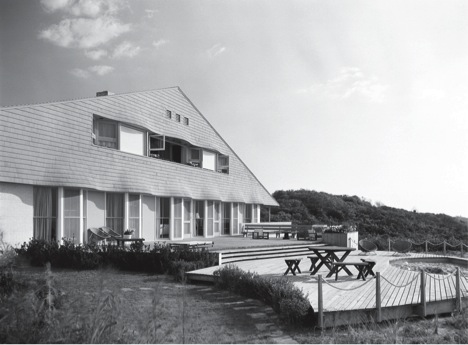
George Nelson and Gordon Chadwick, Spaeth House, East Hampton, Long Island, 1956. Photograph by Ezra Stoller © Esto.
Nelson’s most consequential commission from the U.S. Information Agency was the 1959 American National Exhibition, in Moscow. There, Soviet premier Nikita Khrushchev and U.S. vice president Richard Nixon had their legendary “kitchen debate,” surrounded (and provoked) by Nelson’s display of American goods. Ralph Caplan explained that this event is where the actors came in: Nelson hired Russian-speaking American students to “inhabit” his junglegym installation and demonstrate what these new commodities did, besides equating freedom with consumption. According to Eisenbrand, Nelson believed that better understanding between the two nations’ peoples could be facilitated by showing what they had in common—the activities of everyday life. Instead of missiles and political speeches, Nelson proffered toys, sports equipment, appliances, and furniture.
Princeton professor Beatriz Colomina put it more succinctly (and prophetically) with the observation, “We are the same, but we have more stuff.” Indeed, capitalism would prove to be less an ideology than a bottomless shopping cart. Nelson may have thought that his picture of material abundance would be an aspiration for Russian audiences, but it was also a taunt. Describing the exhibition’s innovative (and seductive) multimedia strategies, Colomina cited two critical sources of inspiration: the sonic vibrations of crowds in ancient Athenian stadia and the sensory environment of the Ringling Bros. Circus. Nelson, along with the Eameses and Fuller, effectively deconstructed centuries of spectacle for mid-twentieth century audiences. With uncanny prescience, Charles Eames predicted that architecture would become a space of information, and Nelson argued that the value of technology lay in its potential to draw relations among people, places, and things.
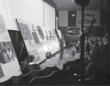
Lecture setup from Art-X, an experimental foundation art course with Charles Eames, University of Georgia, 1953. Photograph courtesy of the Vitra Design Museum.
The ability to synthesize information and re-interpret it to the public wasn’t just a matter of theatrical performance; for Nelson, it was a matter of principle. Yale graphicdesign professor Christopher Pullman (MFAG ’66) brought the point home with particular poignancy. While he was Nelson’s head of graphics from 1969 to 1972, Pullman worked on the redesign of Social Security claim forms. It was notable but characteristic that Nelson would take on this pedestrian project in a career otherwise marked by prestigious exhibitions and supported by corporate largess. Nelson’s brief to Pullman was that this wasn’t to be a redesign of a form but a consideration of how people request benefits via a form—in this case, one fraught with intimidating bureaucratic caveats. Pullman’s recollection of working with Nelson— hammering out first principles together and realizing them independently—described a process that deliberately confounded attempts at attribution.
This was the issue explored by Metropolis editorial director Paul Makovsky, who painted a portrait of a restless intelligence always excited by the next project, not the one at hand. While some certainly saw him as a gadfly, it is inarguable that Nelson the impresario had excellent radar for gifted collaborators, from Isamu Noguchi to Charles and Ray Eames. However, Makovsky offered narratives of lesser-known figures who were actually more central to the day-to-day operations of the office, notably Ron Beckman, Lucia DeRespinis, Ernest Farmer, Irving Harper, and John Pile. Less than generous in crediting individuals, Nelson was more liberal in offering opportunity. Over the years, he helped people see the world being made by unconscious choices and helped to make it better by conscious design.
In charting Nelson’s transition from art direction to systems thinking, Makovksy offered a clue to Nelson’s disregard for specific achievement. For a man preoccupied with design as a meta-practice, incremental successes must have paled against their cumulative effects. (Witness the film of the burning junkyard that he included in the 1961 MoMA exhibition U.S. vs. Us.) Writing in 1976, Nelson expressed this ambivalence about design.
“The myriad categories of design are another example of the proliferation of specialties split off from once-unified disciplines . . . . We live in a technological Tower of Babel where each individual is full of answers, but unable to pass them on to anyone outside the specialty.” (ManTransforms, Cooper-Hewitt Museum.)
Nelson was troubled by the loss of perspective that came with the professionalization of design. He was equally concerned about the proliferation of scientific subspecialties that effectively occluded and distracted from matters of human and planetary survival. In what was the most stimulating paper of the conference, Oberlin professor John Harwood laid out Nelson’s growing understanding of design and technology as intertwined forces of deadly capacity. Like Damocles’ sword, the atomic and hydrogen bombs were and are suspended over the possibility of a future. Simultaneously, designers were and are engaged in creating resource-consuming products and behaviors that lead to wars in the first place. It was in this context that Harwood explored a little-known side of Nelson’s intellect, noting that he was particularly affected by the writings of Austrian economist Joseph Schumpeter (1883–1950). who argued that the “creative destruction” of capitalism is not a passive function of supply and demand; it is an active consequence of a culture of production and consumption, in which subjectivity is destroyed in the making and using of things. Design was clearly implicated.
Unlike Schumpeter, however, Nelson was a committed populist. His forum wasn’t the university or the academic journal. In fact, it turned out to be television. In 1960, he was invited to create a program for the CBS series “Camera Three.” Nelson’s chosen topic: “A Problem of Design: How to Kill People.” His argument: weapons (products of design) transformed conflict between subjects (two equally vulnerable people) into conflict between subjects and objects (people with weapons aiming at otherwise human targets). While the program is generally viewed as a critique of the Cold War mentality, Harwood suggested that Nelson’s real point was to reposition design as a form of mediation between people and peoples, not a means of distancing them from each other. In addition to decrying the immorality of impersonal push-button warfare, Nelson also drew attention to the limitations of things themselves— especially when they are conceived as solutions, not elements of situations shaped by designers and users alike.
When I met him as a Smithsonian Fellow in 1984, just two years before his death, Nelson was adamant that designers turn their attention from objects to systems. He said we should be working on the scale of the Alaska pipeline, not decorating the planet with bar stools and chairs. Had he been with us last November, I suspect he would have been dismayed by the degree of environmental degradation it has taken to start heeding his words, but heartened that design is finally widening its scope to match the breadth of his thinking.

