Reviews & Interviews
Display in Museums and Department Stores
Laura Camerlengo and Alessandra Wood

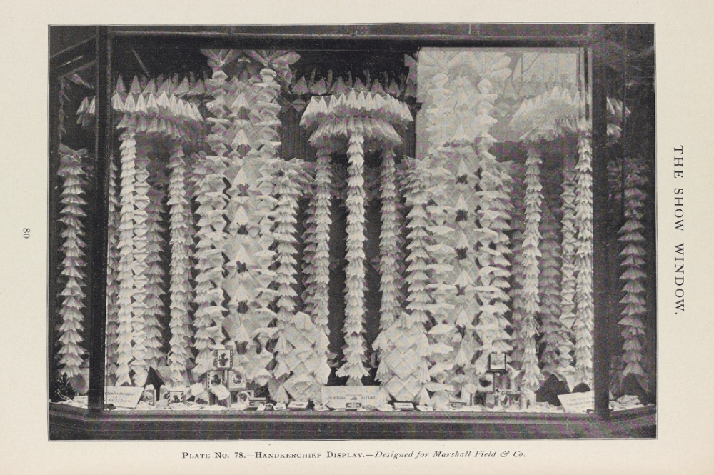
Handkerchief Display — Designed for Marshall Field & Co., The Show Window February 1898
This conversation explores the long-standing parallels between the display of “objects of value” by department stores and museums. Questions will address: 1. Concepts of spectacle and the museumification of displays; 2. The enduring connection between art and consumption, such as during the 1920s and 1930s, continues today (i.e., © MURAKAMI, Brooklyn Museum, 2008); and 3. The transition from guided shopping and museum experiences to “self-guided” encounters. The conversation will conclude with a discussion about the rise of experiential shopping and art presentations by retailers and museums in the twenty-first century to encourage visitorship to, and engagement with, their physical locations. This interview is offered as a complement to Dr. Alessandra Wood’s Designed to Sell: The Evolution of Modern Merchandising and Display (Routledge, 2020) and Laura L. Camerlengo’s current research on San Francisco’s luxury department stores.
Laura L. Camerlengo: Throughout Designed to Sell, you examine the development of merchandise display techniques as well as how the design and organization of retail spaces changed as visual merchandising philosophies emerged in the twentieth century. One theme, in particular, is the parallel between museum displays and displays of merchandise. Can you tell us more about this connection?
Alessandra Wood: Yes, the “museumification” of retail environments morphed spaces of commerce into spaces of intrigue and education. When behemoth department stores emerged in the late 19th century, the architecture itself captivated shoppers’ attention, perhaps even competing with the goods within the space. Standard modes of display at this time paid homage to the idea of spectacle and excess, hoping to provoke consumer desire. Displays, such as Marshall Field & Company’s handkerchief window design (image The Show Window February 1898), might showcase hundreds of pieces of one object on view. There is a sort of post-industrial revolution shock and awe at the sheer number of items within a display like this; it shows power, wealth, and the store’s ability to afford to stock so many pieces.
This idea of excess and display was part of the cultural ideology of display, and museum curators used similar methods to display historical objects. An image of the Jade Room from the Metropolitan Museum of Art in 1907 shows this tactic in use (Image Jade Room 1907). With more than 14 cases filled with precious jade, the curators attempt to show as much as possible and create a complete historical guide to a specific material. Just as the handkerchiefs suggest power and wealth, the notion of excess is clearly expressed to the visitors as this display shows the impressive breadth of the museum’s collection as well as the amassed wealth.
The shared visual vocabulary between educational institutions and retail environments elevated the cultural properties of merchandise. If an object is behind a glass case, all of a sudden, it feels more expensive, rare, even collectible, which is a high order for mundane objects. In the same way, museum curators told visitors what to see and what was “good,” retailers used methods of display and curation to tell customers what to buy. At the turn of the twentieth century, both institutions were known for outstanding judgment and essentially gave a seal of approval to the objects within them.

The Jade Room: The Miriam and Ira D. Wallach Division of Art, Prints and Photographs: Photography Collection, The New York Public Library. “Jade Room, Metropolitan Museum of Art” New York Public Library Digital Collections. Accessed August 2, 2023. https://digitalcollections.nypl.org/items/510d47d9-a031-a3d9-e040-e00a18064a99
LLC: It is interesting to also consider the parallels between museum displays and retail environments today. On perhaps a granular level, we see the use of similar, if not the same, casework, lighting and audio-visual equipment, and mannequins (for fashion displays), which creates a visual overlap between the two kinds of spaces and a resemblance in how “precious objects” are presented for visual consumption. But when we consider exhibitions over the past twenty years, we also see these parallels extend to the inclusion of retail spaces within museum exhibitions – I am thinking most famously of the Louis Vuitton boutique in © Murakami at the Brooklyn Museum in 2008. To some, this might seem like a contemporary flattening of the distinctions that have long separated “high” and “low” art, but in your text, you trace this development back by a century. Tell us more.
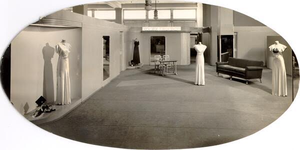
AW: As we look at mid-twentieth-century merchandise display, the shifts in popular techniques mirror shifts in museum display techniques. In the 1920s, modern artists such as Alfred Stieglitz and his contemporaries redefined the trending model of display in museums and galleries. Rather than the salon model of display with gallery walls filled with art, Stieglitz employed a curated approach to art display, much like what we are used to seeing in museums today. We see this curated display approach translated into retail environments as well. As a new discipline of “display men” emerges, they transform merchandise display away from spectacle and excess into a highly curated selection of goods presented in a theatrical mode. A great example of this is an image of The White House Department Store in San Francisco from 1938. There are only four gowns on display within the department – they remind me of actors on a stage with spotlights directing your attention to them. Display and department managers chose these pieces to be on view for specific reasons that may have included showcasing certain brands or fashion styles.

Interior of the White House Department Store, San Francisco, 1938, San Francisco History Center, San Francisco Historical Photograph Collection, San Francisco Public Library
The connection between art and commerce goes deeper, though, as department stores were used as spaces to educate the public on new design trends. Leveraging the model room, a concept very familiar to museum-goers, store designers introduced new furniture and decorative arts to a more general public unfamiliar with modern design trends in an attempt to familiarize them with new designs. As noted in Selling Good Design: Promoting the Modern Interior by Marilyn Friedman (Rizzoli, 2003), in the 1920s, these types of rooms were common in the interwar period and essential in helping the public understand modern furniture. Wanamaker’s in Philadelphia and Macy’s in New York City, for example, used model rooms to exhibit the “Modernistic” design trends shown at the 1925 Paris Exhibition, educating the general public on this blazen new style and offering it for sale.
In the post-war era, exhibitions such as Good Design, a yearly show which debuted in 1950, sponsored by MoMA and held at the Chicago Merchandise Mart, show the partnership between retail spaces and museums. This form of sponsorship and display served not only to educate the public on new designs but also to present actual products for purchase. As MoMA showcased the winning pieces from Good Design, in these types of partnerships, it is not merely a visual vocabulary that creates the connection between art and commerce via similar modes of display but an actual elevation or conferring of artistic status to merchandise using the tactics of display.
LLC: In your book, you address the transition from guided shopping experiences to “self-guided” encounters, particularly since the postwar era. This, too, is comparable to the developments we have witnessed in museum visitor experiences, which have shifted in recent decades to support autonomous visits – I am thinking here, specifically, of the use of audio guides. In the past decade, we have also seen the rise of immersive experiences with AR/VR technologies and the introduction of hybrid or omnichannel engagement, such as accessing content in person but also on social media, a museum blog, YouTube, etc. Have similar changes occurred in the retail landscape – where do you think the fusion between art and commerce might go next?
AW: I think we are in a moment similar to the mid-century retail competition, except instead of just retailers competing for shoppers, it is restaurants, museums, and cultural experiences all competing for visitors. I think we might see a flashback to some early-twentieth-century retail experiences where shoppers might see fashion shows, entertainment, dine, have childcare, and visit the salon – what better way is there to draw in the most visitors than by giving them everything they need!
Laura L. Camerlengo is Curator in Charge of Costume and Textile Arts at the Fine Arts Museums of San Francisco. She has curated, co-curated, and presented exhibitions on a range of subjects for the Museums, including Contemporary Muslim Fashions (2018) and Patrick Kelly: Runway of Love (2021). She is currently organizing the special exhibition, Fashioning San Francisco: A Century of Style, on the Museums’ collection of twentieth- and twenty-first-century high fashion and haute couture. Laura holds a M.A. in the History of Decorative Arts and Design from Parsons, the New School of Design/Cooper Hewitt, Smithsonian Design Museum.
Dr. Alessandra Wood is a design historian with an eye towards the future. She is the author of Designed to Sell: The Evolution of Modern Merchandising and Display (Routledge, 2020), which presents an engaging account of mid-twentieth-century retail design and display in America. Alessandra received her PhD at the University of Delaware, her MA in History of Design and Decorative Arts from Parsons, The New School for Design/Cooper Hewitt Design Museum, and her BA in History of Art from Johns Hopkins University. A lover of design history and theory, she is obsessed with applying that knowledge to understand what makes products beautiful, useful, and successful, and what inspires people to love those products. Her superpower is the ability to visit a mall once and memorize its layout. She lives in the Bay Area with her family and teaches design history at the university level.
