Issue 5 2021 Long Essays
WPA Posters: Art for The Common Good
Arpie Gennetian
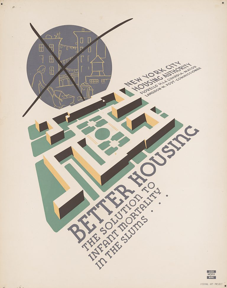
Fig. 1 Anthony Velonis, Better Housing: The solution to infant mortality in the slums, New York: Federal Art Project [between 1936 and 1938], color silkscreen. Library of Congress 96510351.
The WPA posters of 1934–1943 bring together the development of the modern poster in America and art for the common good under President Franklin Delano Roosevelt’s Second New Deal. These posters were used to rally citizens at a time of social and economic crisis in the United States. They were used to connect the individual with the welfare of the nation.1 The posters also encouraged people to go and explore the country and to enjoy local community events as ways to escape the privation of the Great Depression.2 Using typography as a design element equal to imagery—and combined with silk-screening3 as a new method of production—WPA posters popularized a new modern art form with a distinct style and straightforward messaging. Unlike the murals commissioned by the WPA, the posters were more readily accessible and within the eyesight of ordinary people so as to educate the public and help the government communicate messages of social reform and awareness throughout the country.4 This paper explores the history of the WPA posters, their connection to European poster-making, and the impact they continue to have in the United States today.
In 1933 the federal government created the Civil Works Administration (CWA) under the Public Works Art Project (PWAP), which was recreated as the Works Progress Administration (WPA) under the Second New Deal. The WPA then established Federal Project Number One, a collection of government-funded programs to employ professionals in the fields of drama, music, writing, and art. By 1938, the visual-arts branch of the program, the Federal Art Project (FAP), which operated from August 1935 until June 1943, included FAP poster divisions in seventeen states and the District of Columbia. These divisions designed posters for the Federal Art, Music, Writers’, and Theatre Projects as well as for other New Deal programs such as the Civilian Conservation Corps. They promoted and advertised programs within individual departments of city and state governments mostly relating to urban housing and public health (Fig. 1).
In New York City, the Mayor’s Poster Project, within the CWA, was founded before the FAP was formally organized, with posters being made for some of Mayor Fiorello LaGuardia’s favorite projects. The department was absorbed by the federal government in 1935 to become the country’s first FAP poster division. New York City was the largest FAP poster division and by 1938, the New York City Poster Project, which employed about 50 artists, had produced a total of 306,472 prints from 11,240 original designs. In total, the Federal Art Project would create over two million copies of approximately thirty-five thousand poster designs.
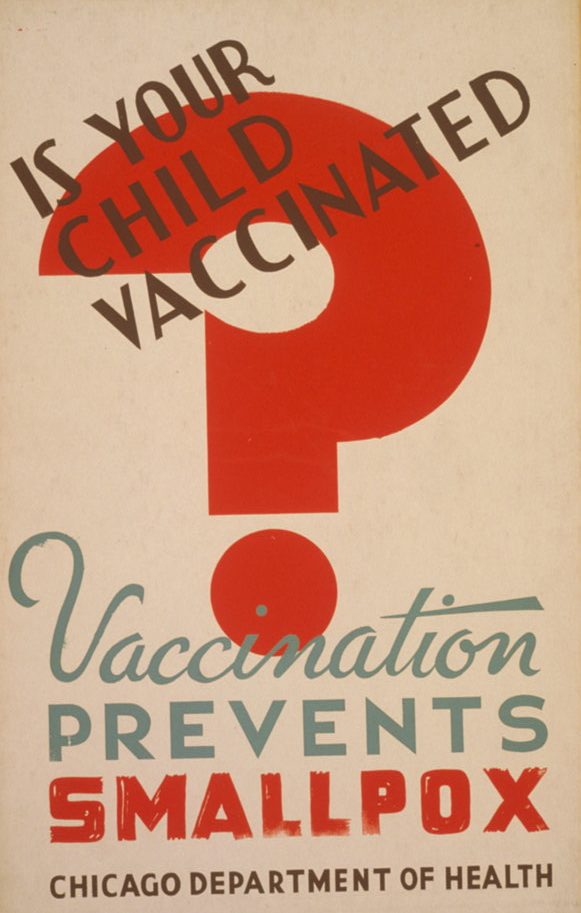
Fig. 2 Is your child vaccinated? Vaccination prevents smallpox, Chicago: Illinois WPA Art Project, 1941. Silkscreen, color. Library of Congress 98507705.
Richard Floethe, an industrial designer born in Germany and educated at the Bauhaus, was art director of the New York City poster division from 1936–1939. Floethe enabled the many illustrators, painters, and graphic designers that worked together in the New York division to experiment and create freely. In an essay written in the 1930s and later published in Art for the Millions: Essays from the 1930s by Artists and Administrators of the WPA Federal Art Project, he wrote, “the government unwittingly launched a movement to improve the commercial poster and raise it to a true art form.”5 Under Floethe’s leadership, the artist Anthony Velonis was hired in 1936 to work for the Federal Art Project in New York City. When Velonis first arrived, posters were being painted and lettered by hand and there was no organized system for mass production. Velonis suggested setting up a silk-screening program to work alongside the poster design studio.6 Silk-screening, at the time, was a technique mostly used for printing textiles and large backgrounds for department store windows. Velonis, having had experience running a print shop with fellow artist Fritz Brosius in his cousin’s home in Astoria, Queens, thought the silk-screening process could be used to aid in faster and more efficient production.7 This modern approach of combining art and industry allowed artists to see their work from concept to completion, and up to six hundred posters could be printed in a single day. Poster design and printing thus became a collaborative effort. Artists were responsible for the design and creation of stencils while the technical staff took the responsibility of screening the posters. This collaboration and exchange of ideas amongst the designers and screeners led to more efficient use of design and color, which created the distinct style of the WPA posters.8
To distinguish the commercial silk-screening process of the past from that of fine art making and to give the WPA posters their due credit as works of art, Velonis coined the term “serigraphy” from “seri,” Latin for silk, and “graphein,” Greek for to write or draw. The term was later popularized by the contemporary art critic and curator of prints and drawings at the Philadelphia Museum of Art from 1941–1963, Carl Zigrosser.9 During a 1994 symposium on the WPA, titled “Amassing ‘American Stuff’: The New Deal Arts Collections of the Library of Congress” and held at the Library of Congress, Velonis stated, “I thought that ‘silkscreen process’ was kind of cumbersome, and it sounded commercial besides.” He continued, “And I thought we had to have something not quite so generic, something more specific, and that was serigraphy.”10 Later in the same interview, Velonis described the WPA Poster Project as a significant moment in the history of art, not just because of the funding but also because so many talented people were working for a common cause. “I couldn’t imagine a better art university than the mixture of artists that came together at that time,” he said. “It was very exciting.”11 In the oral history interview with the Library of Congress in 1965, conducted by Harlan Philips, Velonis talks about how he got started with the WPA, its influence on him, and the community it created.12
Although the silk-screen process directed a type of design, there was no specific style artists had to follow. The WPA Poster Project required only that works be original, of high quality, and able to communicate an idea quickly with clear and simple messages. This was essential to Roosevelt’s New Deal reform program. The posters had to appeal to a broad public and not alienate anyone. They also needed to speak to one’s intellect rather than their sentimentality.13 The silk-screen medium engendered the simplicity and clarity of the message. Ralph Graham, supervisor of the Chicago poster division, stated that “The modern poster was one that succeeded in attracting the public’s attention and conveying its message.”14
Composition, typography, and color are the key elements in any piece of graphic design. However, they are heavily influenced by the medium used to deliver a (given) message. Unlike lithograph printing or “offset” printing, which allows for more detail, silk-screening applies one color at a time and is better suited to simpler designs. When looking at many WPA posters, the use of colored panels is prominent. This mode of design draws the eye in and connects all the elements of the poster together. The bold use of color and shape is also easily seen from a distance, providing the poster with greater visibility and gaining attention from passersby. This was especially necessary in order for the posters to attract notice within a society that was increasingly inundated with printed material.15 Inadvertently, the process of silk-screening as a medium afforded clarity to the messages being conveyed. The concise and very readable structure of these posters was also a signal of modern life.16
It was the influences of European Modernism, the Bauhaus, and Russian Constructivism, however, along with the graphic qualities generated by the silk-screening process, that combined to create the unique style of the WPA posters.17 Floethe’s experience at the Bauhaus might be credited with giving him the aptitude to understand the practical approach of integrating design and production into one studio. Artists such as Floethe also incorporated design traditions learned from Russian Constructivists who transformed typography in the early 1910s. The Russian artist El Lissitzky (1890–1941), for example in Klinom krasnym bei belykh (Beat the Whites with the Red Wedge), had introduced type as an equal element with geometric shapes to establish patterns and create meaning. Typography was no longer bound by the rules of symmetry, and illustration was no longer the only way to tell a story.18 The elimination of unnecessary information and the use of silhouettes and pictograms promoted clear and harmonizing compositions.19 The precedent set by European designers such as Herbert Bayer and László Moholy-Nagy, who also trained at the Bauhaus, was strong. Their use of typography for communicating clearly and precisely as well as its integration into the composition served as inspiration for the poster designs of 1930s America.
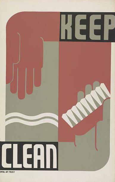
Fig. 3 Keep Clean, Eric Hans Kraus. Rochester, N.Y.: Federal Art Project, 1939, Silkscreen, color, 55.9 x 35.4 cm, Library of Congress 98516190.
In the early twentieth century, posters in Europe and America were mainly used to advertise products or entertainment. The poster thrived both in fine art and applied art, operating at the intersection of business and culture and gaining popular significance.20 In Belgium in 1899, Henry van de Velde introduced one of the first cohesive design programs, using posters as well as packaging and letterhead for the Tropon company. In accordance with the period’s Art Nouveau movement, van de Velde unified fine and applied arts with graphics and typography. The concern for balance between text and image was complicated by the fact that text had to be hand-lettered or spaces left blank to be printed later by letterpress.21 This disconnect was resolved when lettering was treated with the same deference as the rest of the poster. Typography was given equal weight with image.22 The Art Nouveau poster designs of van de Velde led the way for the colored lithographic poster to become the most influential form of commercial advertising at a time when most graphic design was limited by black-and-white printing.23
Peter Behrens, one of the founders of the German Werkbund (1907–1934), took the idea of typography and image having equal prominence in poster design further when, in 1907, he created the design program for the Allgemeine Elektricitäts Gesellschaft, Germany’s largest electric company. Another German graphic designer, Lucian Bernhard, used simple compositions of juxtaposed text and image in advertising posters (ex. Bosch). Influenced by Bernhard, the American James Montgomery Flagg designed the well-known “I Want You for U.S. Army” poster in 1917 and initiated the use of posters by the US government. With the rise of fascism in Europe during the 1930s and 1940s, many artists and graphic designers immigrated to the US, bringing with them new developments in graphic design.24 Posters and graphic design began to achieve status as an art form and as a profession. The WPA was in part responsible for this.
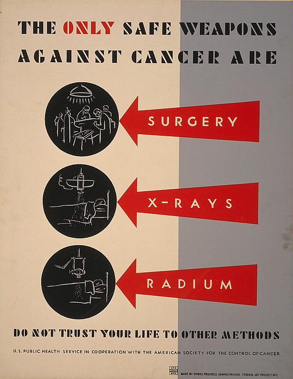
Fig. 4 The only safe weapons against cancer are surgery, x-rays [and] radium. Do not trust your life to other methods, NYC: Works Progress Administration Federal Art Project, 1938. Anthony Velonis. Silkscreen, color. Library of Congress 98517525.
A 1938 issue of Signs of the Times, a journal of advertising and design, stated: “The poster division…is doing a valuable service to the profession in general and the consumer in particular, in trying to combine good craftsmanship and design with original ideas…it is to be hoped that these beneficial WPA productions may act as a stimulating influence to poster artists in all parts of the country.” Richard Floethe, in Art for the Millions, stated that the division’s goal was to “preserve the skill of the unemployed artist” and return artists “to private industry…with more knowledge in their profession and greater confidence in themselves.” The intention of the Poster Project was to employ artists and to communicate New Deal objectives to the general public. The government’s support of artistic expression within the Poster Project also produced an unintended outcome—the creation of an original American poster style.25
Holger Cahill, the national director of the Federal Art Project (FAP) from August 1935 until April 1943, elevated the art of the print and subsequently that of the poster by underscoring its place in society and in the art world. Before his post with the FAP, Cahill served as acting director of the Museum of Modern Art between 1932 and 1933, when the founding director, Alfred H. Barr Jr., took a leave of absence. Cahill’s connection to MoMA continued when an exhibition of the work done under the Federal Art Project of the WPA opened on September 16, 1936, titled New Horizons in American Art. The exhibition was comprised of approximately 150 objects while a similar, smaller exhibition took place at the Duncan Phillips Memorial Gallery in Washington, DC. “This recognition by two leading art museums,” said Cahill, “gives authoritative evidence of the fact that the artists on the Project are producing work of genuine quality and permanent value. During the past year the Federal Art Project has discovered and developed a great many vigorous, fresh and original young talents whose work is a demonstration of the strength and vitality of American art today.”26 The exhibition catalogue highlights “Allied Arts Project: Posters,” and Cahill writes:
Graphic art history shows that each period usually has a predominant interest in one medium. Since the late 1920s lithography has been emphasized. Every general print exhibition since that time has shown lithographs. The character of the medium offers a minimum of technical problems and arbitrary limitations. The public has quickly responded to the rich variation of tone, subtle color suggestions, dramatic contrasts of light and dark, and the great variety of subject matter which have appeared in lithography. Popular interest grew very rapidly.27
Although Cahill does not mention silk-screen as one of the methods of production of prints/posters in the exhibition, his comments show his enthusiasm and appreciation for prints and graphic design in general. He also recognized the role played by the WPA project, which joined together the artist and the common experience—giving art broader purpose beyond art for its own sake. He describes art dedicating talent towards the common good of society as a whole and references a new “living art”: “The print is extremely sensitive to the contemporary environment and is an art rich in social content. It would almost be possible to reconstruct a social history of our period from the prints produced on the Federal Art Project.” 28
The communication of very modern ideas related to social wellbeing and societal welfare were evident in the posters’ messages and in their design. Many WPA posters, for example, served to inform the public about being proactive with their overall health (Fig. 2, 3). The strategy to reform health care in the United States was depicted in many of them and focused on chronic disease and disability.29 With the discovery of Penicillin in 1928, syphilis and many other infectious diseases became treatable, and with this new reality came a national outcry for timely diagnosis. Many WPA posters informed the public of the warning signs of these diseases and advised them to seek medical help. With three decades of work in establishing the US government’s role in cancer research, the National Cancer Act of 1937 represented the first time that Congress provided funding to address a non-communicable disease. Many posters were designed to highlight the importance of proper treatment and the diagnosis of cancer (Fig. 4).
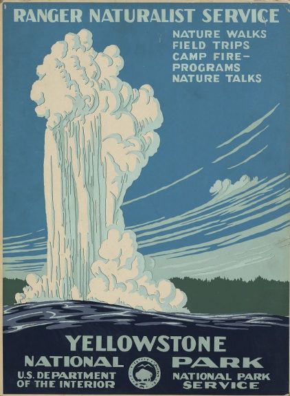
Fig. 5 Yellowstone National Park, Ranger Naturalist Service. C. (Chester) Don Powell, 1938, Screen, color, 48 x 36 cm., Washington DC, Department of the Interior, National Park Service.
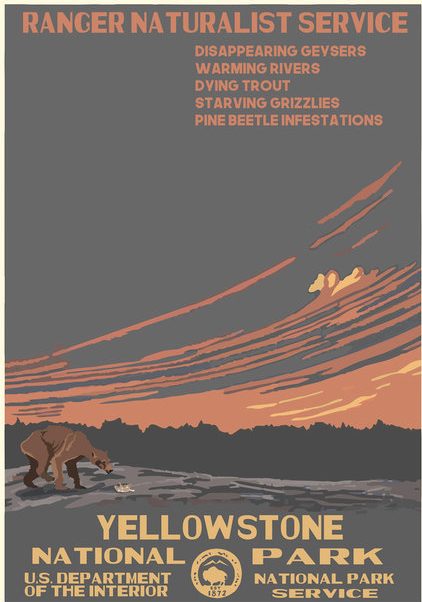
Fig. 6 National Parks 2050, Yellowstone (2017). Created by Hannah Rothstein (@HRothsteinArt, www.hrothstein.com). Courtesy of the artist.
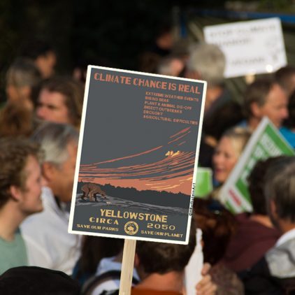
Fig. 7 National Parks 2050, Yellowstone (2017). Created by Hannah Rothstein (@HRothsteinArt, www.hrothstein.com). Courtesy of the artist.
These well-designed posters became vehicles of communication that helped to shape and direct Americans’ behavior. With the creation of the WPA Poster Project, the federal government brought together the artistic community and by default greatly amplified the image of the graphic designer. During World War II, posters transformed from promoting community purposes and social welfare to wartime propaganda and service.30 After the war, however, as the country’s demand for more advertising and commercial business grew, the design profession became organized as never before with design agencies growing in numbers across the United States;31 it profited from the workshops established under the WPA. Today, only about two thousand posters of the over thirty-five thousand designs produced are known to exist. About nine hundred of them are housed in the Prints and Photographs Division of the Library of Congress.32 But the style remains notable and vibrant today.
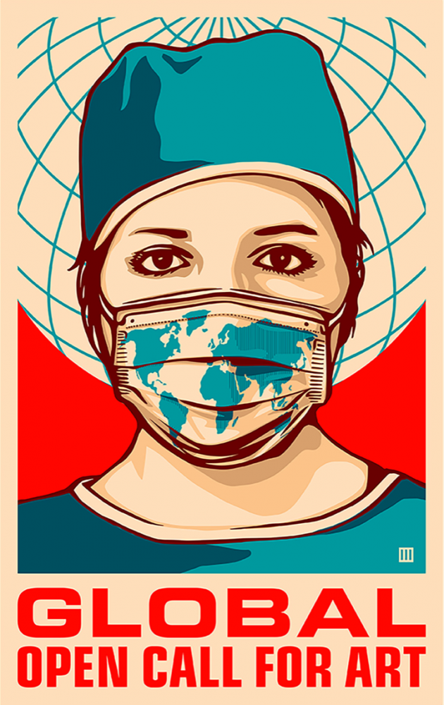
Fig. 8 Thomas Wimberly for “Global Forefront,” an open call for messages that promote health and public safety in the time of COVID-19. Amplifier.
Indeed, the legacy of these WPA posters continues with contemporary artists such as Hannah Rothstein, who by using the WPA National Park poster (Fig. 5) as a backdrop, has created a new series of posters (Figs. 6,7) demonstrating the threat of climate change to the future of our parks, presenting them as they may appear in the year 2050.33 Just recently the design lab Amplifier began sponsoring a global open call for designs that promote health and safety during the time of COVID-19. The promotional image for the open call as well as many of the submitted designs make a strong inspirational reference to the WPA posters of the 1930s (Fig. 8). Amplifier continues to extend open calls for submissions of artwork in the pursuit of using art as power.34 The Responsive Collection Initiative established by Cooper Hewitt, Smithsonian Design Museum during the 2020 health crisis and Black Lives Matter protests also exemplify the continuing significance of graphic design for the social good.
is a fine artist, graphic designer, and student in the History of Design and Curatorial Studies MA program offered jointly by Parsons School of Design and Cooper Hewitt, Smithsonian Design Museum. She is the Chief Designer for the fifth issue and first online version of Objective.
Notes
- Corey Pillen, WPA Posters in an Aesthetic, Social, and Political Context: A New Deal for Design (New York: Routledge, 2020), n.p., (accessed April 26, 2020).
- Allison Meier, “From Camera Clubs to Syphilis: The WPA’s Practical, Modernist Posters,” Hyperallergic, June 24, 2015.
- Silk-screening is another term for screen-printing. The term screen-printing is more commonly used today.
- Zachary Petit, “The WPA: 92 Posters Paid For By the Government,” Print, March 4, 2020.
- “Posters: WPA Posters,” Library of Congress, accessed April 22, 2020.
- John Weaver, administrator of the poster design division, approved Velonis’s suggestion to create a makeshift screen-printing shop. “Posters: WPA Posters,” Library of Congress.
- Meg Miller, “How the WPA Popularized Screen Printing,” Fast Company, April 13, 2016.
- Velonis himself produced nine posters during his time with the WPA, including advertisements for the Federal Theatre Project’s production of Macbeth and “Better Housing: The solution to infant mortality in the slums” (Fig. 1). Later, in 1940, his work was exhibited in “American Color Prints under $10” which opened at the MoMA alongside “Useful Objects of American Design under $10.” The press release for the exhibition indicates the status that prints had achieved as an art form, which, perhaps, was in great part due to Velonis’s work and to the WPA.
- Artists such as Robert Rauschenberg and Andy Warhol popularized the term and technique even further
- “Posters: WPA Posters,” Library of Congress.
- Miller, “How the WPA Popularized Screen Printing.”
- In the oral history interview with the Library of Congress in 1965, conducted by historian Harlan Philips, Velonis shares how he got started with the WPA, its influence on him, and the community it created. For the full interview: Anthony Velonis, “Archives of American Art: Oral history interview with Anthony Velonis,” interview by Harlan Phillips, Smithsonian Institution, October 13,1965, transcript.
- Pillen, WPA Posters, n.p.
- Ibid., n.p.
- Ibid., n.p.
- To view the collection of WPA posters catalogued by the Library of Congress, click here.
- Philip Meggs, A History of Graphic Design. (New York: Van Nostrand Reinhold, 1983), 367.
- Zachary Petit, “The WPA: 92 Posters Paid for by the Government.”
- Pillen, WPA Posters, n.p.
- Stuart Wrede, The Modern Poster: The Museum of Modern Art, New York, [June 6 – September 6, 1988]. (New York: The Museum of Modern Art, 1988), 13–14.
- Wrede, The Modern Poster: The Museum of Modern Art, New York, 17.
- Ibid., 18.
- Ibid., 19.
- Ibid.
- “Posters: WPA Posters,” Library of Congress.
- The Museum of Modern Art. “Press Release, June 15, 1936, New Horizons in American Art.”
- Holger Cahill, New Horizons in American Art (New York: The Museum of Modern Art, 1936), 39.
- Cahill, New Horizons in American Art, 39.
- The National Health Survey of 1935/36 was the largest morbidity survey conducted in the United States and the first to focus on chronic disease and disability. George Weisz, “Epidemiology and Health Care Reform: The National Health Survey of 1935-1936,” AJPH 101, no. 3 (March 2011): 438–47.
- “Posters: WPA Posters,” Library of Congress.
- Petit, “The WPA: 92 Posters Paid for by the Government.”
- Pillen, WPA Posters, n.p.
- Claire Voon, “WPA-Style Posters Imagine a Bleak Future for US National Parks,” Hyperallergic, April 18, 2017.
- “Global Open Call for Art,” Amplifier, accessed March 15, 2021.