Objects
Train-Mapping Berlin in 1939
Chloe Friedenberg

Fig 1. Cover of map. Für Ausflüge die S-Bahn. Bremen: H M Hauschild, October 1939.
In the 1920s, Berlin, Germany was a hub for modern thinking. As German Jewish politician Walther Rathenau wrote, Berlin “signalled a new, distinctly modern attitude in the open acknowledgement of the commercial character of its life.”1 The rise of the Nazi party in the 1930s squashed much of the city’s creative and commercial freedom. The Nazis rejected modernity, instead welcoming the concept of Volksgemeinschaft (Folk Community), which romanticized peasant life and traditional German culture in an effort to unify the German people. A 1939 map of the Deutsche Reichsbahn represents the Volksgemeinschaft desire to escape the hustle and bustle of urban Berlin by returning to the country and nature (Fig. 1). Graphically, this is evident in the map’s embrace of the traditional German font Fraktur and its handwritten form Sütterlin. A heavily serifed Blackletter typeface, Fraktur is a distinctively German font. Reminiscent of the marks of pen and quillwork, the font has roots reaching back to the invention of the printing press. The Nazis returned to Fraktur as an artistic expression rooted in national life with historical ties to folklore and craft.2 Fraktur, in fact, appears throughout the Deutsche Reichsbahn map, with Sütterlin used on the cover for its title “Für Ausflüge die S-Bahn” (“For excursions [take] the S-Bahn”). In the bottom left corner of the map, Fraktur is again used for a note admonishing travelers (Fig. 2): “Schützt die Natur! Sie ist für euch die Quelle, an der ihr Erholung sucht und neue Arbeitskraft schöpfen follt…beschädigt nicht die Bäume und lärmt nicht in der heiligen Stille des Waldes.” (“Protect nature! For you it is the source where you look for relaxation and where you should draw new energy…don’t damage the trees and don’t make noise in the sacred silence of the forest.”)3
However, since Fraktur does not easily scale into small print, the font is not appropriate for map details such as a legend which, at the bottom of the piece, tells the viewer how to read the map’s symbols. For the legend and urban areas, the Deutsche Reichsbahn map instead utilizes a sans serif font for better legibility. An italicized form of this is also employed for train stops to differentiate between towns and stations (Fig. 3). Ironically, this sans serif font can be compared to Futura, a typeface created at the Bauhaus, a progressive German school of design, founded in 1919 and closed by the Nazis in 1933. Futura, created by Bauhaus designer Paul Renner, “was on the cutting edge of experimental, geometrically derived typefaces,” and—with its streamlined circles, squares, and triangles —stands in direct contrast to Fraktur.4 Notably, the map retains Fraktur for labeling forests, rivers, and other natural beauties of the German landscape, thereby linking them typographically to the Volksgemeinschaft idea of German national identity. The Deutsche Reichsbahn map, in its usage of two distinct typefaces, conveys how graphic design is simultaneously functional and political.

Fig. 2 Bottom left corner of map with text re protecting nature and some of map key beneath map. Für Ausflüge die S-Bahn. Bremen: H M Hauschild, October 1939.
Interestingly, two years after the map was printed, the Nazi party decided that Fraktur and the Sütterlin handwriting were ‘Jewish’ forms of lettering and banned the typeface– despite the fact that both Jewish and non-Jewish typesetters had been printing and writing documents in Germany using Fraktur for centuries. That a typeface could be banned for its symbolic associations further demonstrates the power of design as an intentional political tool.5 In 1941, the Nazi party began to use Antiqua —the same font that many European countries used in the twentieth century —foregoing the German identity which resided in the earlier use of Fraktur. Some speculate whether the Nazis truly believed that Fraktur was identifiably Jewish or if they were trying to modernize and rid themselves of a dated, regressive typeface; anti-Semitism provided a convenient reason for doing so.6
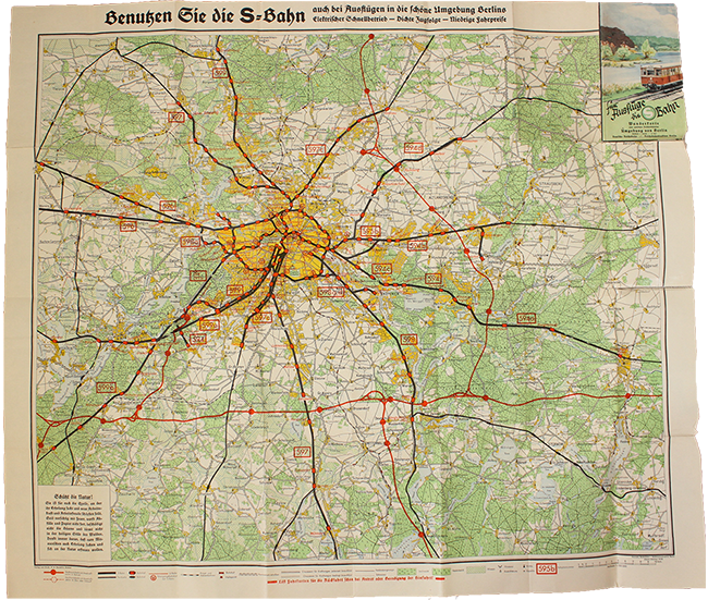
Fig. 3 Whole map unfolded. Für Ausflüge die S-Bahn. Bremen: H M Hauschild, October 1939.
As for me, this 1939 Deutsche Reichsbahn map demonstrates how a political message can be pushed or propagandized—and detected—through a close reading of typography and graphic design. Ultimately, I decided to give this map away because of the uncomfortable associations it had for me. I did not want to keep the map, but I remain grateful for what I learned from it.
Chloe Friedenberg is a 2023 graduate of the MA Program in the History of Design and Curatorial Studies jointly offered by Parsons School of Design and Cooper Hewitt, Smithsonian Design Museum. She concentrated on East German design history and theory and twentieth-century American visual culture and is currently working as a cataloger of twentieth-century design.
NOTES
- Jeremy Aynsley, Graphic Design in Germany: 1890-1945 (Berkeley: University of California Press, 2000), 51.
- Jeremy Aynsley, Graphic Design in Germany: 1890-1945, 184.
- Für Ausflüge die S-Bahn, map. Bremen: Verlag und Druck: H M Hauschild, 1939, Print.
- Rob Saunders and Ellen Lupton, Bauhaus Typography at 100 (San Francisco: Letterform Archives, 2021), 232.
- “A Nazi font banned by Nazis? Fraktur and its legacy in the must-listen design podcast of this week,” Typeroom, February 21, 2020, https://www.typeroom.eu/a-nazi-font-banned-by-nazis-fraktur-legacy-must-listen-design-podcast.
- Ibid.