Reviews & Interviews
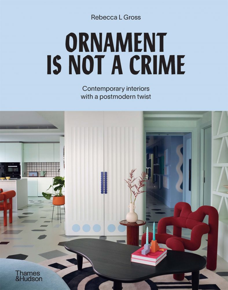
Ornament is not a crime: Contemporary interiors with a postmodern twist
Rebecca Gross

Adventures in Space by Owl Design, London, UK. Photograph © Rachael Smith
Thames & Hudson, 2023. Due out in Australia in September 2023. Due out in North America and the UK in Spring 2024.
Many modernist architects and designers of the 20th century designed by some hard-and-fast rules: ‘form follows function,’ ‘less is more,’ and ‘ornament is a crime.’1 While these architectural creeds resulted in striking modern buildings and spaces, they left little room for expression, diversity, or informality. From the 1970s through to the early 1990s, a new wave of architects and designers rebelled against the rules, rationality, and utopian ideals of modernism. They broke free from formality and seriousness, and created fresh, provocative designs across architecture, furniture, lamps, mirrors, homewares, and more.
Dubbed ‘post-modern’ by architectural historian and cultural theorist Charles Jencks, the new language of design featured color, pattern, materials, ornament, and motifs. They weren’t used without meaning – in the early stages, at least. Rather, they appealed to the senses and served as signifiers for function and context; a communicative and emotive language that carried meaning and expression.
Postmodern architects and designers – such as Robert Venturi and Denise Scott Brown, Michael Graves, and Charles Moore in America, and groups such as Archizoom Associati, Superstudio, and Memphis in Italy – challenged traditional forms and functions and added decoration for aesthetic effect. They blurred the lines of high art and popular culture, as well as the hierarchies of ‘high’ and ‘low’ materials and ‘good’ and ‘bad’ taste. Cheap materials were used to make expensive products, and history and symbolism became a treasure trove of inspiration with nods to classicism, nostalgia, and tongue-in-cheek references. After decades of modernism, design could be populist and kitsch, witty and flippant. The enduring was eschewed for the ephemeral, as these designers never intended their objects to be part of an everlasting fashion.
As the 1980s progressed, the bold postmodern style became the designer look of the decade, associated with corporate capitalism, conspicuous consumption, and excess. And as it trickled down to the mainstream, it became more surface than substance – its ideas and intentions diluted and its forms and ornament merely pastiche.
Becoming misunderstood – even controversial – the postmodern movement was relatively short-lived and by the 1990s, modernism began to dominate again. Minimalism boomed in the 2000s, accompanied by the mid-century modern revival and the popularity of Scandinavian design. With it, architecture and interiors began to lose the rich visual expression of previous decades.
In recent years, the cyclical tides of design have seen a resurgence in the popularity of postmodernism and the work of the Memphis Group and other architects and designers of that era. In the same way that postmodernism followed modernism, the themes behind PoMo are emerging again, after decades of pared-back minimalism.
Ornament is not a crime: Contemporary interiors with a postmodern twist features twenty-one homes and five designers that display themes of postmodern design, sometimes knowingly and literally, and sometimes incidentally. Bold colors and patterns, the celebration of surfaces, and the juxtaposition of materials transform the ordinary and everyday. There are twists and plays on shape, scale, and form; expressive and symbolic references; and a good dose of whimsy and wit.
Like the postmodernists, this is not done without meaning. Each of the interiors is reflective of the clients and the designers. The strong concepts are driven by personalities, preferences, interests and memories, all imagined in vibrant and expressive ways.
Australian studio WOWOWA’s design process, which it calls “story-in-place”, embeds the owners’ nostalgic memories and special experiences into their home through colors, materials, and forms. “For us, ornament is not a crime. Ornament is architectural, and the layering of ornamentation changes the way you perceive and experience a space. Life is too short for boring spaces,” says architect Monique Woodward.2 For the kitchen in the book, WOWOWA used a palette of confectionary colors, including banana-yellow benchtops inspired by Paddle Pop ice-creams, as a reminder of childhood days (Fig. 1).

Graphic House by Office S&M London, UK. Photograph © French + Tye
For Graphic House, UK practice Office S&M, installed a white benchtop splattered with yellow, blue, and pink. The material is made from recycled white milk bottles and melted-down colorful plates and cutlery (Fig. 2). “It’s like having the residues of a feast actually make your kitchen table,” architect Catrina Stewart says.3
In the Netherlands, Studio Job used wallpaper that evokes brick, wood grain and crazy paving to bring the look and feel of outside materials inside, playing with perception and visual effect. In the kitchen, the joinery and rangehood are covered with a cartoon-like three-dimensional red brick that contributes to the fantastical world designer Job Smeets created in this apartment (Fig. 3).
The furniture and objects featured in the five designer profiles also break from conventional design, with forms and functionality reimagined in playful, sensory, and refreshing ways. Marta Figueiredo’s series of larger-than-life totems was inspired by Oskar Schlemmer’s costumes for The Triadic Ballet, performed at the Bauhaus in 1922. Performance was a fun, improvisational, and free-spirited side of the Bauhaus school. “I was particularly drawn to Johannes Itten’s maxim about play being regarded as fundamental for creative thinking: ‘Play becomes party – party becomes work – work becomes play,’” says Marta.4 She conceived the Prima Familia series with scale and proportions that abstract the human form, and three-dimensional surfaces that prompt people to touch, feel, and even hug the totems (Fig. 4). “I was surprized with what I gave life to, and the emotional connection people have with them,” Marta says.5
The homes, furniture and objects featured throughout the book demonstrate that form doesn’t have to follow function, less is not always more and ornament is not a crime. Rather architecture and design can be a vehicle of expression and communication, a way to incite happiness and joy, and to infuse our homes and lives with richness, vitality and meaning.
Rebecca Gross is Sydney-based writer who specialises in architecture, design and design history. She has a master’s degree in the history of decorative arts and design from Parsons School of Design (class of 2014). Rebecca frequently writes for print and online media in Australia and has written and edited several books. Ornament is not a crime: Contemporary interiors with a postmodern twist is her latest book, published with Thames & Hudson.
NOTES
- Louis Sullivan coined the phrase ‘form follows function’; Ludwig Mies van der Rohe is famous for the dictum ‘less is more;’ Adolf Loos wrote an essay and lecture titled “Ornament and crime.”
- Rebecca Gross, Ornament is not a crime: Contemporary interiors with a postmodern twist (Melbourne: Thames & Hudson, 2023), 40.
- Gross, Ornament is not a crime, 54.
- Gross, Ornament is not a crime, 51.
- Ibid.
