Issue 5 2021 Long Essays
Immigration and Advertising: Benetton and the Power of Provocation
Margaret Simons
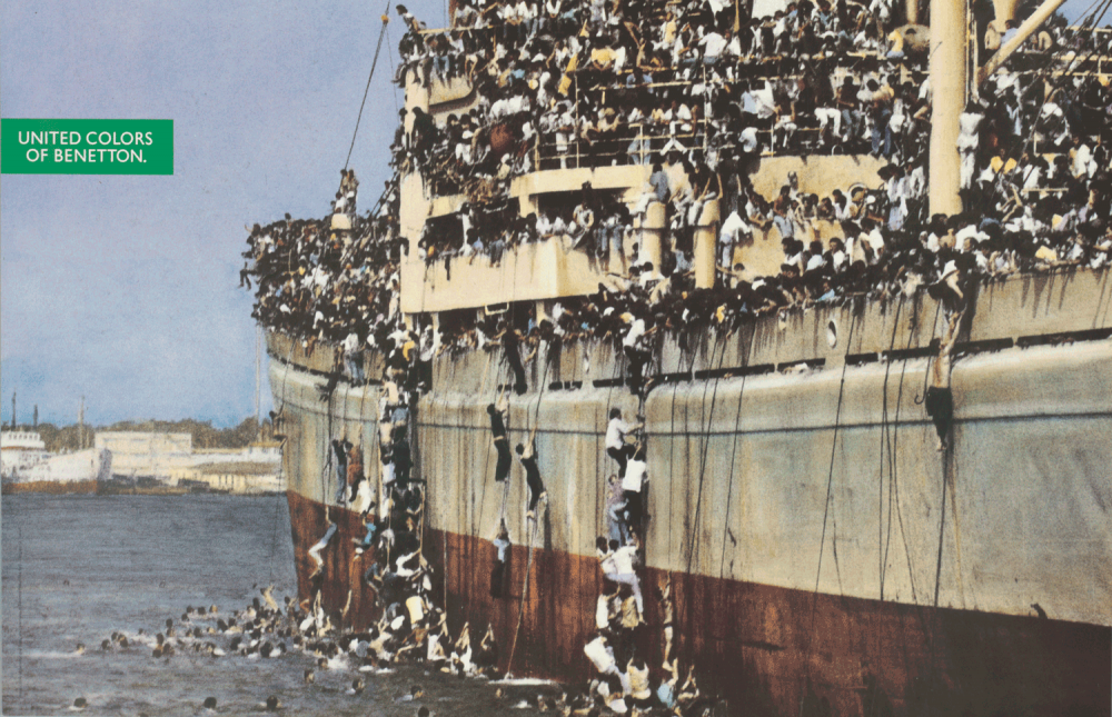
Fig. 1 Poster designed by Oliviero Toscani for Benetton Group based on an Associated Press photograph (photo credit in the Colors issue 2), Untitled (1992 advertising campaign), Poster on paper printed with color lithograph, 1992, (Cooper Hewitt, Smithsonian Design Museum, New York, NY).
Migration and art have long orbited each other as inspiration and expression, but this connection gets complicated when commercial art enters the fray. The artistic desire to inform, inspire, and provoke distorts with the corporate mandate to sell. Despite the risk, Benetton Group S.r.l. and its surrogates purposefully promoted immigration as an advertising strategy over the last thirty years with disruptive results. In the early 1990s, Benetton solidified its place as a fashion-forward, progressive international clothing brand through its controversial media presence; three printed works in the Cooper Hewitt, Smithsonian Design Museum archives—a poster (Fig. 1), a magazine, and a party invitation (Fig. 2)—include variations of the same attention-grabbing Associated Press (AP) photograph of a vessel with refugees clinging to the hull. The long-range image of émigrés in tattered clothing scrambling to escape political calamity presented a strangely disturbing and oppositional message for an apparel brand, but Benetton was already renowned for breaking conventional advertising morés, and this focus on the politics of immigration exemplified their approach. In 2018, the company pointed its spotlight on immigration again with a social media and newspaper campaign incorporating a refugee evacuation photograph captured by the nonprofit SOS Méditerranée. The swift, negative public reaction to the company’s use of that photograph and the company’s deletion of the post indicate that the three printed works from the 1990s are artifacts specific to their creators and the historical moment, employing strategy that will likely not be repeated.
The three printed works manifest the artistic alliance of three separate parties, each advancing their own point of view: international fashion brand Benetton, headquartered in Veneto, Italy; photographer and Benetton Creative Director Oliviero Toscani; and Tibor Kalman, editor in chief of Colors, Benetton’s in-house magazine. Respected graphic visionaries, Toscani and Kalman zealously publicized the positive outcomes of immigration, understood the power of provocation to garner attention, and adhered to the theory that the image dominates the written word when reaching an audience. The designers presented the issue with a hybrid intention. They viewed themselves as journalists informing their viewers and activists inspiring political action. However, by advocating under the banner of the Benetton brand, viewers were offered another choice: they could tacitly agree with the designers’ sentiments by purchasing merchandise.
The original AP Photograph
Immigration emerged as a pressing issue in early 1990s Europe as the grip of communism receded and people started leaving Eastern Bloc countries for Western European republics. Rapid emigration was prompted by unemployment and food shortages as communism faltered throughout Eastern European countries, including Albania. Residents fled Albania in droves, seeking refuge across Western Europe, especially in Italy, a short distance across the Adriatic Sea. Thousands of these refugees began collecting in the port cities of countries such as Greece, Croatia, and Italy; they often found themselves detained, taxing local resources as the nations weighed their collective conscience about accepting a large population of immigrants. The original AP photograph used by Benetton had been taken for use by international news outlets and depicts 4,000 Albanian refugees leaving port en route to Italy.1 The image brims with the action of a hasty escape, as some émigrés swim toward the hull while others who have reached the freighter actively scale the sides. The mass of humanity crammed onto every deck and railing of the vessel conveys desperation to viewers and symbolizes the thousands who preceded and would follow.
-
- Fig. 3 Poster designed by Oliviero Toscani for Benetton Group based on a photograph by Patrick Robert, Untitled (1992 advertising campaign), Poster on paper printed with color lithograph, 1992, (Cooper Hewitt, Smithsonian Design Museum, New York, NY).
-
- Fig. 4 Poster designed by Oliviero Toscani for Benetton Group based on a photograph by Steve McCurry, Untitled (1992 advertising campaign), Poster on paper printed with color lithograph, 1992, (Cooper Hewitt, Smithsonian Design Museum, New York, NY).
The Poster
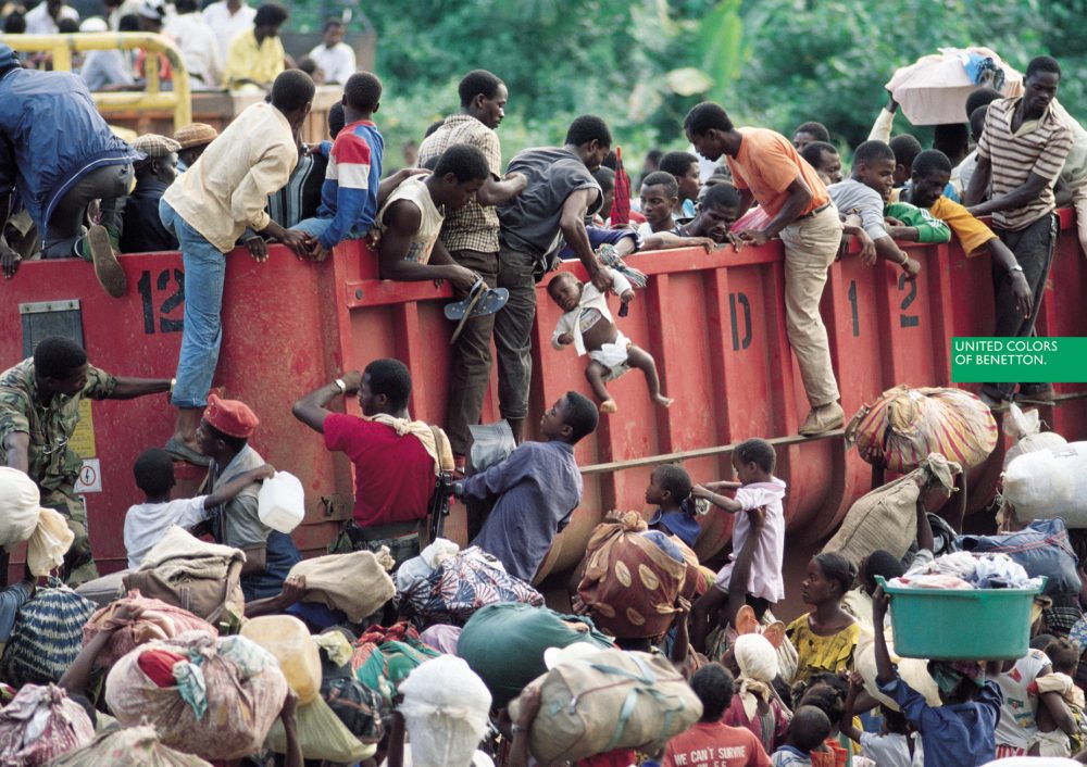
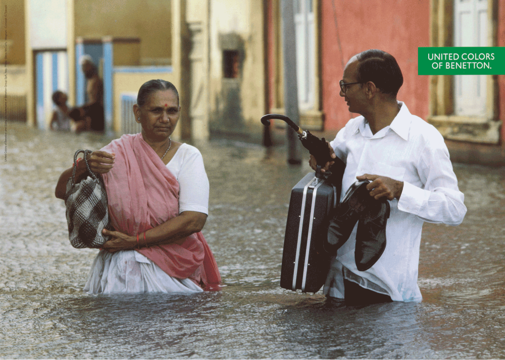
The poster using the AP photograph was part of a wider advertising campaign spearheaded by Toscani, a noted photographer in his own right, who was hired by Benetton in 1982 to direct its visual presence. In the late 1980s, Toscani dramatically shifted the corporation’s $80 million global advertising budget away from campaigns that featured racially diverse models draped in woolens and knitwear to take a more politically active stance.2 While models of varied backgrounds in sweaters of assorted colors literally embody the slogan “United Colors of Benetton,” Toscani went a step further to associate the slogan with a gritty, realistic diversity. The immigration poster was one in a series utilized in the Spring/Summer 1992 campaign, thematically unified by a photojournalistic style that aligned Benetton with an articulated point of view. With Toscani’s move from photographer to editor, he purposefully chose images that evoked emotion from the viewer. Toscani not only refrained from using any images he personally photographed, but no Benetton clothes were featured in the ads either. The photographs were instead borrowed from photojournalists and media outlets with a purpose more in line with information distribution than fashion sales. In addition to the repurposed AP photograph, other provocative shots borrowed from news photographers and deployed in the campaign included a truck overrun by refugees in Liberia (Fig. 3) (including a baby precariously dangling from the top of the cargo hold), a couple commuting through a waist-deep flood in Bangladesh (Fig. 4), and a mafia killing marked by a menacingly dark pool of blood in Palermo, Italy (Fig. 5). Eventually, Toscani’s repeated publication of eye-grabbing, norm-breaking images in advertising campaigns would give rise to the categorization “shockvertising.”
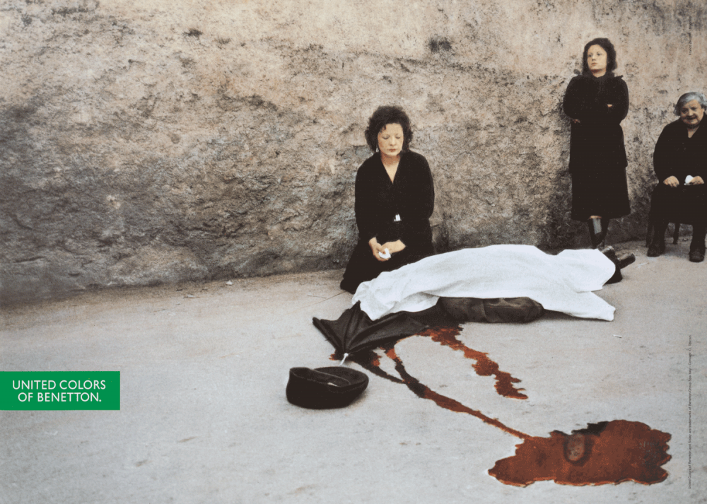
Fig. 5 Poster designed by Oliviero Toscani for Benetton Group based on a photograph by Franco Zecchni, Untitled (1992 advertising campaign), Poster on paper printed with color lithograph, 1992, (Cooper Hewitt, Smithsonian Design Museum, New York, NY).
Toscani required the viewer to understand the poster’s messages only through its images; no words assisted context other than the brand’s logo. The only text on all four posters is the familiar green rectangle logo with white sans serif font pronouncing the “United Colors of Benetton” off to the side. Benetton implemented the slogan around 1989 as a celebration of cultural differences, coinciding with Toscani’s advertising experiments with controversial subject matter. Applied to the poster, the meaning of “United Colors” transcended clothing hues to include multiculturalism. Toscani championed open-border policies and a worldwide acceptance of immigration on behalf of Benetton by depicting the distress of the refugee experience, cultivating support through the use of a powerful image with only a tagline.
Toscani’s disdain for audience research and testing demonstrates his “all publicity is good publicity” attitude and lack of concern with the immediate impact on his employer’s corporate goal to increase clothing sales. In a 2017 interview, Toscani referred to advertising agencies and marketing research as a “fog” that obfuscates the primary intentions of publicity.3 The primary goal for Toscani was generating publicity (good or bad) for an issue he cared about; the type of reaction was secondary. In fact, the poster featuring the AP photograph was banned by governments who feared public reaction and political ramifications, including France and Denmark.4 Toscani and Benetton weathered the bans, appreciated the free publicity and media attention, and moved forward with the advertising campaign.
The reuse of photographs originally intended as news coverage could have invited discord for Toscani if the photographers and news outlets disagreed with the adaptation. Fortunately for Benetton, they approved of Toscani’s description-less editorial treatment of the posters. Patrick Robert, who captured the Liberian truck overflowing with refugees, commented, “The absence of an explanatory caption on my photographs does not bother me.…For me, the objective of the campaign is reached…to draw public attention to these victims.”5 As a photojournalist, Robert regularly published emotionally moving photographs of individuals during battle or flight, and the enhanced circulation of his stirring image only furthered his goal to inform the larger world. Although the purpose of the original photograph may have changed when it was adapted as an advertisement, Toscani did share Robert’s objective.
The Magazine
Toscani and Kalman synergistically selected the AP photograph for the cover of the second issue of Colors, Spring/Summer 1992, an issue entirely focused on immigration. Kalman’s selection of an immigration theme was unsurprising as he himself embodied the United States immigrant success story. Kalman fled communist Hungary during his childhood and launched a successful design career in New York. In the foreword to Liz Farrelly’s biography, Tibor Kalman: Design and Undesign, the designer referred to his immigrant experience as a fortunate blessing, “I am lucky. Lucky to have been born in 1949. I got to live in a real live communist country until I was seven. I got to escape in the middle of the night. I got to live in 1950s suburban America. I got to be a caddie and to make burgers at a fast food restaurant. I got to college in 1968.”6 Kalman used the AP photograph to encourage cultural assimilation, just as he experienced it.
As the first single-theme edition of Colors, Kalman enthusiastically endorsed immigration with the cover pronouncement, “Immigration brings…new blood, new food, new music, new worlds, new movies, new beliefs, new romantic possibilities, and new excuses for parades to…an old world.”7 With this statement, Kalman upheld the positive impact of immigration, depicting immigrants as cultural ambassadors who enrich the countries where they settle. The bold headlines and articles inside the issue highlight the positive contributions immigrants infuse into all corners of life and underscore the unique variations we take for granted in our clothing, food, and traditions that evolved in different corners of the world. The words appearing on the cover’s masthead and issue description conspire to engage viewer attention, imbue the photograph with a pro-immigration stance, and facilitate a tacit agreement with the audience that immigration should be welcomed everywhere.
The name Colors served as a brand extension of the corporate catchphrase “United Colors of Benetton” and its idealistic spirit of youth, inclusivity, cultural diversity, and assimilation. From the beginning, Kalman envisioned Colors’ worldwide voice and distribution.
Benetton’s concept was to found a magazine that would be international and targeted at a young audience. I agreed with these priorities and thought that the magazine needed to be primarily visual, since reading is now an endangered pastime. I believed it necessary to figure out a way to tell a story with pictures—to invert the usual relationship between words and images. And since it was a magazine aimed at young people all over the world, it had to be as relevant to a teenager in Manila as to one in Berlin or Cape Town.8
With its launch in 1991, one million copies of Colors were produced and distributed in over 7,000 Benetton stores across 85 countries in six dual-language variations (with English always represented as one of the languages).9 Given the distribution strategy, the global message was delivered to readers who were primarily White consumers who could afford the clothing and resided in the industrialized countries where the stores were located. While Kalman harbored an idealistic view of readership, the reliance on the brand’s corporate distribution channels for circulation would ultimately stymie his goal.
The release of the Colors immigration issue at stores coincided with the Toscani-directed advertisement campaign featuring the same image. As editor in chief, it was Kalman’s decision to choose the cover photograph, but given Toscani’s role as editorial director of the magazine and creative director for the entire brand, it was clearly a coordinated effort. By deploying the AP image in two simultaneous forms of public display under the Benetton name, the magazine provided obvious context for the caption-less poster campaign and connected the corporate entity with an undeniably pro-immigration stance. Once the reader had viewed the magazine cover or skimmed its contents, which featured beneficial cultural contributions from around the globe, the purpose of the wordless advertising campaign embedded in the posters no longer remained ambiguous. The intentionality of the images suffused the related advertising campaign with definitive rather than assumed messaging.
The deployment of a social issue such as immigration to tug simultaneously at the heart- and purse strings of consumers resembles the “modern hedonism” model described by Colin Campbell in his essay “Consuming Goods and the Good of Consuming.” He posited that as consumers’ basic needs were fully satiated, new motivations surfaced, focused less on the need-satisfaction cycle and more on the attainment of a desired emotional state.10 Campbell compared the consumer’s state of mind to “daydreaming,” during which they derive deep satisfaction by purchasing goods that move them closer to an emotionally blissful state. Given Campbell’s reading, we can suggest that Benetton tacitly celebrated the benefits of open immigration by using the AP image for its advertising, clarified its message through using it on the Colors magazine cover, and then reaped sales from consumers associating themselves with the messaging.
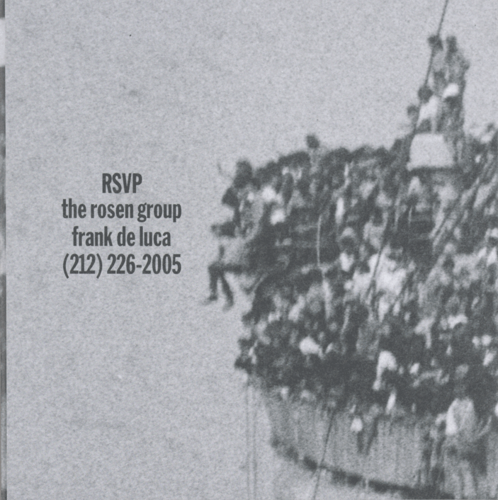
Fig. 2 Design overseen by Tibor Kalman, M & Co. and created for Oliviero Toscani, Invitation to Colors magazine launch party – Printed with offset lithography on paper, 1992, (Cooper Hewitt, Smithsonian Design Museum, New York, NY).
The Invitation
Campbell’s theory also may elucidate why Colors magazine used a grainy close-up of the immigration photograph on the front of the party invitation for the magazine launch party in 1992. On the surface, it may seem odd to have an image of refugees on a packed ocean liner to persuade attendees to RSVP to a celebration. However, if the invitation instilled pathos in its recipients, attendance might instill feelings of virtuousness, and that sentiment would spill over to the magazine and the company.
The decision to employ a close-up of the AP photograph on the front of the invitation, in contrast to the broader view of the original photograph, deserves further attention. Taken from a distance, the wide angle version of the photograph on the poster and magazine cover acknowledges the deep chasm that exists between the refugees and safety. The viewer remains a distant observer. In contrast, the cropped, grainy close-up view on the invitation focuses on a particular evacuee whose legs swing freely, secured only by fellow passengers who grasp his upper arms. The scene amplifies the call to action to attend the party and support the magazine’s editorial point of view. Perhaps the attendee will even experience the Campbell-predicted state of bliss.
Editorial vs. Corporate Point of View
From a corporate perspective, the repurposing of the AP image as an advertising poster, magazine cover, and party invitation tied the Benetton brand to a profitable point of view. Benetton Communications Director Pascal Somarriba believed Colors’s mission or “idea was to transmit a world view, a society [sic] view of the company.…When people buy something, they want to know what’s behind it, the philosophy. We expect to make it clearer to the public where we stand and what we think.”11 Benetton as a corporation eschewed the third-party reporting of a news outlet. Instead, it promoted an opinion that aligned itself with potential customers to draw expenditures to their brand. Somarriba saw the advertising and magazine as two vehicles with which to promote Benetton’s social and political beliefs. The poster raised the issue, while the magazine articulated the ideology.12 Somarriba’s statement inadvertently affirmed Benetton’s belief in the Campbell philosophy. In exchange for the delivery of a pro-immigration image and message, like-minded consumers would assert their agreement and feel good by purchasing Benetton-branded goods. In fact, the purchasing power of the consumer could be seen as paralleling the act of voting in the democratic process. In his book Sold American: Consumption and Citizenship, Charles McGovern posits that consumption by consumer-citizens metaphorically “elects” products as if they were candidates representing one’s sociopolitical views. In the case of Benetton, consumer purchases translated into supportive votes for policies in favor of the immigrants depicted in the AP photograph.13
Two conflicting motivations simultaneously existed in the Benetton sphere: Toscani and Kalman wished to affect a humanitarian response by informing and outraging the viewing public, while Benetton sought to align with and prompt sales to customers distressed by injustice. All parties wanted to elicit attention by repurposing the AP photograph; however, it was the desired reaction that differed. Toscani and Kalman wanted to inform viewers to enact change in the world. Benetton wanted to excite customers to enact sales. Toscani and Kalman viewed themselves as news providers with an altruistic point of view, not as corporate pitchmen or fundraisers; they unrealistically equated freedom of expression with corporate humanitarianism. As long as Toscani, Kalman, and Benetton achieved their desired result, the motivations coexisted harmoniously.
While Toscani would live to see the evolution in the perception of his work, Kalman left Colors in 1995 and died in 1999 without seeing how the magazine and its controversial use of imagery weathered time. Technically, Benetton’s full financial backing of Colors, including its publishing costs and distribution at stores, might categorize the periodical as an advertorial: an advertisement that mimics editorial content by giving the appearance of an independent magazine. Although there was only one advertisement in the entire immigration issue, a two-page Benetton spread, the title’s reference to the Benetton tagline brands the entire issue. Despite appearances, however, advertising was not the intent of its editors, and Kalman vociferously defended his independence from corporate influence over the course of his thirteen-edition tenure at Colors when he asserted, “We were never under any pressure to publish articles about sweaters or Luciano Benetton’s art collection. We did articles about poverty, multiple cultures, things that mattered. The amount of influence our sponsor or advertisers had over our publication was less than in other supposedly ‘independent’ commercial magazines I’ve worked for. We were free.”14
Oliverio Toscani agreed with Kalman’s characterization of editorial freedom and their drive to inform. He affirmed his role as news communicant when he asserted,
If you want to do charity, do it silently, don’t put it on the page of your advertisement, giving five, ten percent of sales to charity, that’s bulls–t. Who is paying for that? Your client is. Through our communication, we wanted to tell the world what was going on, AIDS is here, discrimination is here, racism is here. Those are not social campaigns, it’s news.15
By claiming the Benetton advertisements were intended to inform, Toscani absolved himself of the responsibility to be a social activist, just as one might expect news outlets to primarily inform and not assist. Toscani continued the practice of repurposing shocking images for advertising purposes well into the twenty-first century and considered his purposes important and informative, not commercial, despite the fact that he worked on behalf of a brand who benefitted from his editorial choices.
Conclusion
In 2018, Toscani repurposed an image of African migrants searching for safe harbor off the Italian coastline for a Benetton advertising campaign that appeared online and in the Italian newspaper La Repubblica. The photograph was taken by Kenny Karpov on behalf of the German nonprofit SOS Méditerranée on June 8, 2018 in the midst of a rescue. The close-up of refugees crowded on an inflatable raft allowed viewers to notice facial expressions, particularly those of three individuals in the center frame, legs straddling the side of the raft, some even acknowledging the photographer. The advertisement received wide, immediate criticism; the nonprofit disassociated itself from the campaign, and Italian Interior Minister Matteo Salvini questioned on Twitter, ”Am I the only one to find this despicable?”16
Toscani purposefully timed the viral marketing campaign to attract attention to Italy’s new populist government, who rejected the docking of the rescue ship Aquarius a week earlier in Malta. Carrying over 600 migrants, including 120 unaccompanied children, the ship ported later in Valencia, Spain. Emboldened by Salvini’s remarks, Toscani responded that the criticism “makes me realize I’m right” to highlight the issue by repurposing the image.17 Nevertheless, the post was subsequently deleted from the Twitter accounts of Benetton and SOS Méditerranée in an attempt to erase evidence of the conflict. The controversy threatened Benetton’s commercial goals, and with the erasure of the post, the company halted Toscani’s discretion and assumed editorial control. Once Benetton witnessed that Toscani’s technique of repurposing photographs did not translate well in the rapid-fire world of social media and the cultural climate of 2018, the company revoked his editorial freedom. In fact, the company has not posted on Twitter since November 8, 2018 and fired Toscani in 2020.
In the early 1990s when the AP photograph of the Albanian refugees fleeing was originally reused by Benetton in three forms of printed work—a poster, a magazine, and an invitation—two purposes peacefully coexisted. Kalman and Toscani, understanding the power of image and inspired outrage, conveyed a political stance and manifested a call to action among their audience. Benetton rode the wave of publicity and welcomed consumers who wished to associate themselves with a pro-immigration brand. By 2018, the cultural landscape dramatically changed, and the power dynamics between the creator and sponsor had shifted. With public and political opinions quickly able to multiply on social media, challenging the corporate motivations for using the SOS Méditerranée photograph, Benetton sensed the discord as harmful to its brand and halted and erased the advertising campaign. In the almost thirty years between the two advertising campaigns, Benetton’s retail dominance diminished significantly, new advertising and publishing platforms emerged, and fresh political faces appeared. Yet, one constant between the two advertising campaigns remains: immigration is a controversial issue that continues to inspire photojournalism, editorial commentary, and strong public sentiment. The three printed works that used the AP photograph are vestiges of Kalman and Toscani’s subsidized, artistic newsmaking in the 1990s—objects that cannot be deleted so easily as Toscani’s social media postings.
is a student of History of Design and Curatorial Studies in the MA program offered jointly by Parsons School of Design and Cooper Hewitt, Smithsonian Design Museum. She is currently a Collections and Development Specialist at Alice Austen House. Prior to joining AAH, she held curatorial fellowship positions at the Museum of Modern Art and Cooper Hewitt. Her MBA and prior career in finance informs her interest in the intersection of design and commerce.
Notes
- “Archive,” Colors.
- Ibid.
- Luisa Zargani, “Media People: Oliviero Toscani on Benetton’s New Campaign, Communication, Integration and Fake News,” WWD, November 30, 2017.
- Jonathan Mantle, Benetton: The Family, the Business and the Brand (London: Little, Brown and Company UK, 1999), 197.
- Mantel, Benetton, 197.
- Liz Farrelly, Tibor Kalman, Design and Undesign (New York, NY: Watson-Guptill, 1998), 7.
- Tibor Kalman, Colors, Issue no. 2, Spring/Summer 1992, cover.
- Farrelly, Tibor Kalman, 52.
- Mantel, Benetton, 194; Michael Bierut and Peter Hall, eds., Tibor Kalman: Perverse Optimist (New York, NY: Princeton Architectural Press, 2000), 242.
- Colin Campbell, “Consuming Goods and the Good of Consuming,” Critical Review 8, no. 4 (Fall 1994): 503.
- Julia Thrift, “Benetton Flogs the Philosophy of Jumpers,” Marketing, February 24, 1994, 35.
- Ibid.
- Charles McGovern, Sold American: Consumption and Citizenship, 1890-1945, (Chapel Hill: University of North Carolina Press, 2006), 68. On page 89, McGovern reinforces the point through the words of pioneering American retailer Edward Filene (1860–1937), who compared shopping to voting and retail stores to the polling centers: “They have elected the General Electric Company, and Woolworth’s and all the other great industrial and business leaders of the day….This election of business leadership is constant. The polls are open everyday, and the voters vote when they feel like voting.”
- Moira Cullen, “Reputations: Tibor Kalman,” Eye Magazine, Spring 1996.
- Zargani, “Media People”
- Yeginsu, Ceylan. “Benetton ‘Migrants’ Ads Draw Outrage for Using Photos of Real Migrants,” New York Times, June 21, 2018.
- “Italy Migrants: Benetton Criticized over Ad Campaign.” BBC News, BBC, June 20, 2018.