

The Future of Chinese Font Design: The Role of the Calligrapher
Lucas Justinien Pérez
The monk Huai Su (懷素, 737-799 CE) grew 10,000 banana trees outside his home so he could use the leaves for calligraphy practice in place of rice paper which was rare and expensive in Tang dynasty China (618-907 AD). Born in Changsha, he traveled to the western capital in search of knowledge and advanced calligraphy training. He eventually impressed important officials of his age and gained fame for an especially gestural abstracted form of Chinese hand writing called tsao-shu (草書), which literally means “grass writing.” His autobiography is one of the only surviving examples of his writing left.1 In the 25-foot-long scroll, he describes his many exploits and achievements with monk-like humility:
…尚書司勳郎盧象。… the High Minister Lu Xiang
小宗伯張正言。 and the minor ritual official Zhang Zheng Yan
曾為歌詩。 had composed a song,
故敘之曰。 in which they said,
開士懷素。 “A gentleman is Huai Su,
僧中之英。 a hero among monks,
氣概通束。 of firm resolve,
性靈豁暢。 and open heart,
精心草聖。 A dedicated sage of the cursive style.
積有歲時。 Collecting many years of experience,
江嶺之間。 From the Long River to the Five Mountain Ranges
其名大著。 his name has become well-known.”2
Today Huai Su’s writing is used as a classical example for calligraphers around the world who wish to deepen their understanding of this style. Today as in the past, calligraphy is enjoyed as a form of meditation, relaxation, and mind-body practice.3 In countries that have developed their own calligraphy traditions such as Japan, Taiwan, and Korea, it not only represents an artistic practice but a philosophy embedded in thriving communities that have developed unique approaches to character design. Calligraphy is a part of the primary school experience for many students. In Japan, for example, middle school children fulfill a minimum two years of practice in class. In the last eight years of my own research, I heard adults describe these courses as “torturous.” Yet, they also speak of a nostalgia for the smell of ink and starched white paper and the sound of ink sticks rubbing against stones.
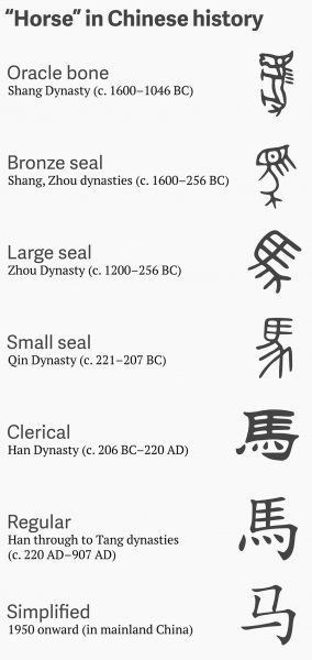
Figure 1. The progression of the character for “horse.” 2015.
Courtesy of QZ.com
Anyone who practices calligraphy inherits a tradition that spans 5,000 years, when the first pictographic Chinese glyphs were scratched onto the shoulder blades of oxen or turtle shells during the Shang dynasty (1600-1046 BCE). Soothsayers were said to throw the inscribed “oracle bones” into a fire and read omens from the way the bones splintered or cracked.4 These omens were typically related to royal questions about crops, warfare, or fortune. For hundreds of years, farmers have been unearthing these bones from a pit outside the city of Anyang in Henan province, China. For most of this time they were mistakenly sold as “dragon bones” in traditional Chinese medicine shops. It wasn’t until 1895 that politician and scholar Wang Yirong recognized these glyphs as proto-Chinese characters. His discovery filled in missing parts of the history of the development of these characters, and it dramatically increased our understanding of how they progressed from representative pictographs to highly abstracted modern characters. (Fig. 1)
The history of calligraphy is not a linear story and there have been many periods of redaction, re-stylization, simplification, and abstraction; from Emperor Qin Shi Huang’s (秦始皇 221 BCE) destruction of texts bearing older writing styles to Mao Tse-tung’s 1956 push for greater literacy in the countryside, which resulted in the National Standard Character Set (国家标准) of 1980. The history of Chinese characters is really the history of East Asian calligraphy, and there was little difference between the two until movable wooden type was developed in 11th century China. When the first typefaces were designed, people naturally looked to the way the characters were written with a brush as the source for a legible “block” style. The traditional shapes made with a brush are vitally important because they’re closely tied to legibility; even minor changes to the strokes can render some characters confusing or illegible. The long evolution of the characters from bones to calligraphy to movable type produced a standard or regular block character style called kaishu (楷書). This is the script style that is nearly ubiquitous anywhere you see Chinese characters being used.
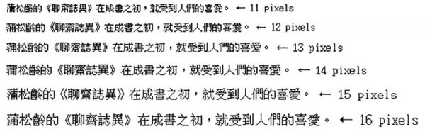
Figure 2. The progression of characters’ legibility as pixels increased. Courtesy of QZ.com.
In the digital age, character writing systems evolved again this time for computer screens and a western QWERTY keyboard. When early fonts were 8-bits, Chinese characters couldn’t even be represented legibly so intermediate phonetic symbols had to be used instead. They also had to be typed using a keyboard created for 62 Roman letters and numbers, confining text to a set of predetermined characters. The 84 keys of a standard keyboard had to express 6,766 simplified characters used in mainland China and 13,051 traditional characters used in Japan, Hong Kong, and Taiwan. (Fig. 2)
The complication of the written language and the vast number of characters that require designing makes the creation of a new complete Chinese character font an overwhelming challenge. Each complete typeface contains at least 6,766 characters that would have to be designed. As design journalist Nikhil Sonnad writes, “Raw numbers of fonts are hard to come by, but suffice it to say that there are far fewer for Chinese than there are for Latin languages.” 5 Today there is more demand than supply for new and interesting fonts that can express characters in a variety of styles both traditional and contemporary. A quick Internet search produces many half-complete font sets for download which usually contain only a fraction of the characters needed for literacy. There are just a few “raw” fonts that come built into most devices.
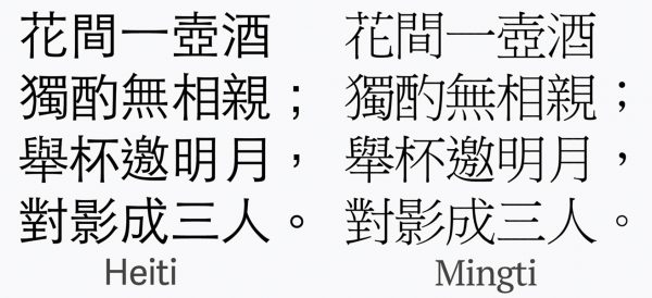
Figure 3. A side-by-side comparison between the Heiti (sans-serif) and Mingti (serif) characters.
Courtesy of QZ.com.
There is a list of basic CJK fonts (Chinese/Japanese/Korean), which are categorized as Simplified Chinese, Traditional Chinese, Japanese, and Korean font sets. All fonts using Chinese characters are divided into sets that have no serifs added (called Heiti) or have serifs added (Mingti). (Fig. 3) As it stands now, one of the only major CJK fonts that has any calligraphic sensibility is a Japanese font called “Hanazono Mincho,” because it bares traces of a “stroke order” originally inked with a brush. This font has been adapted for use in Taiwan as well.
One can imagine given these limitations that users of Chinese characters can grow bored with the same fonts that dominate print and digital landscapes. Companies like Taiwan-based JustFont are quickly mobilizing. In 2015, JustFont utilized crowdfunding sites to raise fast money for a new traditional character font called “Jin Xuan.” Within 80 minutes of launching their crowdfunding campaign, they raised NT$1.5 million (USD$48,300). Blogger Kassy Cho writes of JustFont’s new Jin Xuan font: “Named after a variety of oolong tea originating in Taiwan, Jin Xuan is a font that, according to JustFont, is both rational and emotional, combining the warmth of the Ming (明體) typeface (serif) and the modernity of the Hei (黑體) typeface (sans-serif).”6 Projects like these have to be taken on by teams of designers who undergo a complicated research process into calligraphy, existing Chinese character fonts, and Latin-based fonts to develop an overarching style or philosophy that must unify thousands of characters. Then each individual character has to be sketched out on grid paper and refined for balance, legibility, and creative flair. Most fonts, whether simplified or traditional, reflect in some way a connection to the history of East Asian calligraphy. That is why it is essential that designers continue looking at classical and contemporary calligraphers who have experimented with the same issues of balance, individual character design, and artistic flair versus legibility. There is real opportunity for design teams who take on a Chinese character font project. Traditional calligraphers also have the ability, with their technical and critical know-how, to inspire a push towards new paradigms in typeface design.
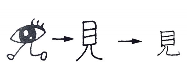
Figure 4. The progression of the character for “see.” Courtesy of Kanji Text Research Group.
The international community of people who study or practice East Asian calligraphy is truly vast, spanning not only China, Japan, and Korea, but Europe and North America as well. Within these communities there are long-standing discourses surrounding Chinese characters. From these conversations, experimental writing styles are developing not unlike the Western contemporary art world. Calligraphers know how to break the rules “properly,” and have long engaged in a kind of written word play linked to the ancient history of each character. Take, for example, the character “to see (見),” which in the original pictograph was an eye with two legs (perhaps implying a sort of motion in the act of seeing), but which was turned on its side and given squared edges over time, in other words it took on a “stroke order” from left to right, top to bottom.7 (Fig. 4)
In Japan, calligraphy has been systematized to the point that there are groups that collect dues and grade writing, even running annual or bi-annual tests. Students progress through ranked levels in groups that can include thousands of members, and hundreds of groups exist in Japan alone. Yearly calligraphy expositions like the Mainichi Shodo-Ten (毎日書道展), sponsored by the daily newspaper Mainichi Shinbun, have applicants from all over the world who exhibit a wide range of contemporary and classically inspired calligraphic works of art. In places like the Mainichi Shodo-Ten there is a treasure trove of mark-making potential for new fonts.8
In East Asia, there is already a large market for calligraphic typeface. Local restaurants and regional products such as Japanese sake use logos that are often created by a master calligrapher. There are instances where the “cracked bowl” beauty of the hand-written is an appealing trope used to evoke feelings of nostalgia, home, and family. Think of an English font you might use for Main Street, America. The popular Japanese fast food chain Ootoya, found all over Japan, serves local comfort foods and brands itself with a logo which borders on kawaii (or “cute”) with its bubbly strokes, while preserving a certain traditional integrity. Comparatively, the logo for Ikkoryu Fukuoka Ramen is designed with angles that evoke modernity and movement. The famous sake company, Koshino Kanbai, uses a typical font script that you see on many Japanese sake bottles.
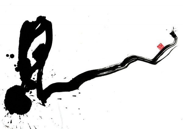
Figure 5. The character “to see,” written by calligrapher Asami Maeda. Courtesy Asami Maeda.
The ubiquitous “regular block” style is here to stay, but there is a need for creative alternatives that appeal to different lifestyles, identities, and feelings. (Fig. 5) Devices now have screen resolution to display highly stylized Chinese characters in detail, so it is not impossible to think that these alternatives would be used in digital spaces with ever-increasing frequency. This essay presents a case that will hopefully prompt designers to investigate the potentials of involving more contemporary calligraphy in typeface design. This line of research has become the lead-in to a much greater question of the ways in which calligraphy influences how all digital language is expressed. The focus is not on returning to tradition but rather intersecting typography with modern calligraphic ingenuity.
1 Huai Su, The Autobiography of Huai Su, ed. Dongmei Wang (Hong Kong: The Chinese University Press, 2006).↵
2 Huai Su, “Huai Su’s Autobiography in English,” trans. Lou YiRu (劉戌흔), sdmz.webatu.com/ha-auto.pr.html.↵
3 Yuho Tseng, A History of Chinese Calligraphy (Hong Kong: The Chinese University Press, April, 1993) 15-85.↵
4 Richard Sears, “Chinese Etymology,” Chineseetymology.org, posted 2011, http://www.chineseetymology.org/why_study.aspx.↵
5 Nikhil Sonnad, “The Long, Incredibly Torturous, and Fascinating Process of Creating a Chinese Font,” Quartz, December 2015, http://qz.com/522079/the-long-incredibly-tortuous-and-fascinating-process-of-creating-a-chinese-font/.↵
6 Kassy Cho, “Just Our Type: Introducing Jin Xuan, A Traditional Chinese Font by and for Taiwan,” City543.com, September 10, 2015, city543.com/taipei/2015/09/10/just-our-type-introducing-jin-xuan-a-traditional-chinese-font-by-and-for-taiwan/.↵
7 Kanji Text Research Group, 250 Essential Japanese Kanji Characters (Hong Kong: Tuttle Publishing, 2008).↵
8 Nunca Silva, “Writing as Art: The Mainichi Shodoten,” Vimeo, 2015, duration 4:55, vimeo.com/101756553.↵
Author Affiliations
Lucas Justinien Pérez
MFA student, Fine Arts, Parsons School of Design

Plot(s) Journal of Design Studies is an annual academic publication edited by graduate students at Parsons School of Design, The New School in New York. The international peer-reviewed journal explores the multiplicity of definitions within design and draws from a broader field of academic disciplines including visual and material culture, anthropology, sociology, and beyond.
Parsons is now offering a Graduate Minor in Design Studies that is designed to complement the MA History of Design and Curatorial Studies and other graduate programs across the university in design, liberal arts, and social research.
 DESIGN STUDIES BLOG
RECENT POSTS:
To celebrate the release of Designing in Dark Times: an Arendtian Lexicon, we are organizing a series of dialogues to further explore what “dark times” means today and design’s recent positioning towards the expanded field of the society within it through an Arendtian lens. Each Dialogue will convene several of the book’s contributors to discuss… Read More
Thursday, November 14 6:00 pm Kellen Auditorium 66 5th Avenue We know Guy Debord (1931-1994) as a poet, filmmaker, artist, revolutionary theorist, editor and founder of the Situationist International avant-garde movement. But above all else, he was a strategist: poetry, cinema, theory and the avant-garde were, for Debord, means to be deployed in a struggle… Read More