


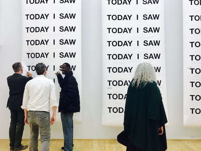


StereoType: New Directions in Typography is on view in the Sheila C. Johnson Design Center until December 15. Curated by Ginger Gregg Duggan and Judith Hoos Fox of c2 curatorsquared, this traveling exhibit presents work by 14 designers from across the globe that challenge and expand conventional notions of typography. These artists merge animation, craft, performance art, graffiti, and even microbiology with typography, and incorporate time, space, and motion to adapt the medium to fit the technological age.
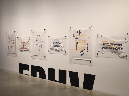
Wordigami by Design Studio Edhv
The exhibit represents language and type in multiple ways and dimensions. Wordigami by Design Studio Edhv, for example, portrays typography in its traditional home on the printed page, but with a twist. The series, created in 2009, is comprised of three pairs of posters, each containing a written phrase. The words read one way on the flat page, but when the paper is fashioned into an origami-like shape, an entirely different, often contradictory message is revealed. By requiring the poster to be folded and unfolded in order to uncover its true meaning, the work finds different ways for text to be read other than linearly on a flat page. It also highlights how the written word never has a singular meaning, but rather multiple ones depending on how it is interpreted or manipulated by a human agent.
Feedback by Oded Ezer uses video to lift type off the page and bring it into the digital world. The piece, which features images of mouths opening and closing that scroll across the page and form letters, melds together the spoken word and the written word and, in doing so, posits the act of speaking as a sort of typeface in itself.
Going beyond the digital realm, Masashi Kawamura’s 2010 series T-Shirts places font into the physical space that humans occupy. In the work, the Japanese artist renders black T-shirts, a representation of the letter “T,” into the likeness of five different fonts. T-Shirts pays tribute to the relationship between the body and typography, in which descriptors of font (terms such as typeface, body, and character) evoke the human form. The enlarged figure of the letters makes the different typefaces more exaggerated and apparent, capturing the idiosyncrasies of both fonts and human bodies. Tactile Alphabet by Dominique Falla, created in 2014, functions in a similar way to transform language into a tangible object. Falla fashions each letter of the alphabet out of materials such as lace and beads to create a three-dimensional language that people can touch and feel.
UK artist Alida Sayer attempts to imagine a fourth dimension that type can occupy. She takes quotes from Kurt Vonnegut’s Slaughterhouse-Five and prints them on stacks of paper that she artfully cuts away at, leaving behind multi-layered sculptural works. The layers in the pieces are a metaphor for the passage of time, with the peaks representing real-time and the sub-levels representing the past. Sayer’s representation of time as the “fourth dimension” is emblematic of the way that StereoType questions not just the art of typography itself, but also the way we communicate with each other through the written and spoken word. It’s also emblematic of how the exhibition as a whole imagines beyond the current ways we communicate, and showing us new ways we can do so.
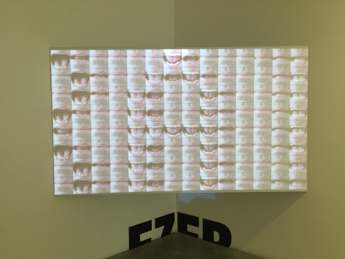
Feedback by Oded Ezer
written by Ana Miljak
StereoType: New Directions in Typography is on view at The Sheila C. Johnson Design Center’s Anna-Maria and Stephan Kellen Gallery, 2 West 13th St. thorugh Tuesday, December 15th, 2015
